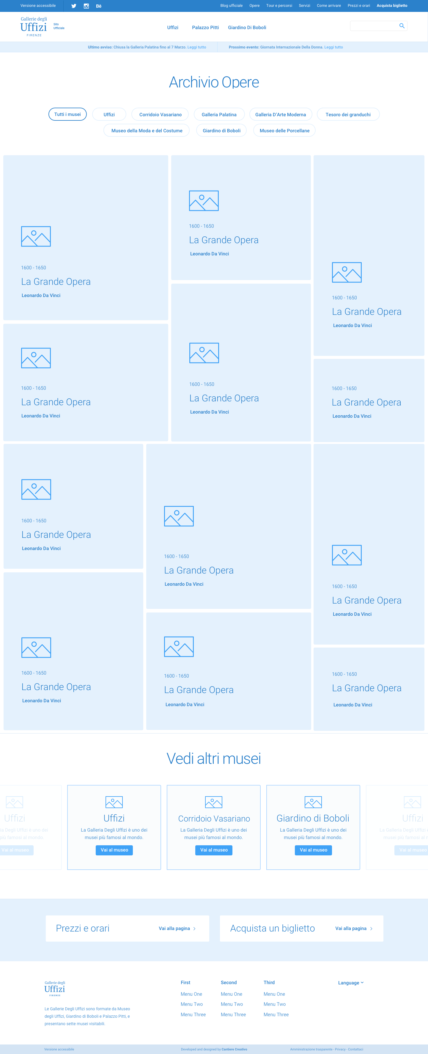
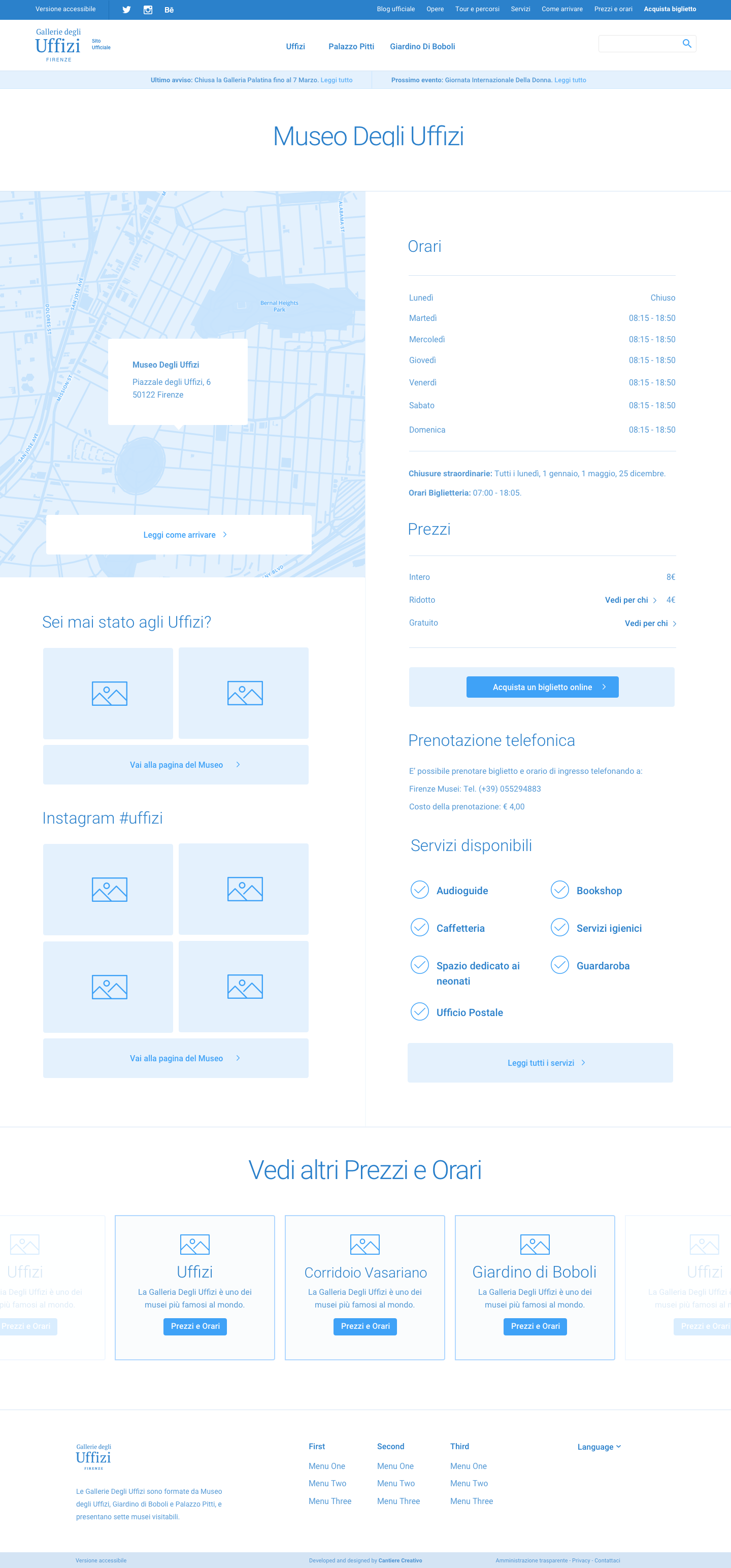
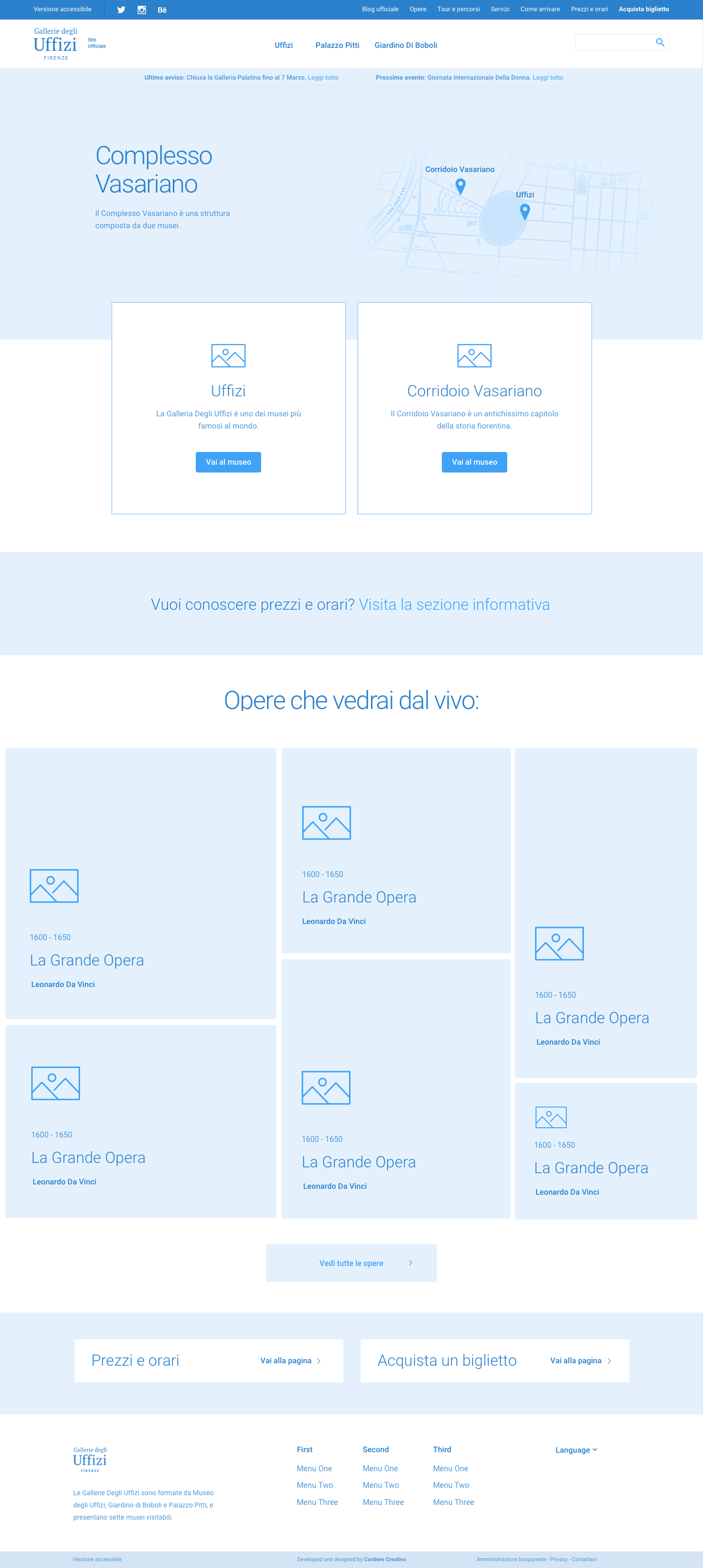
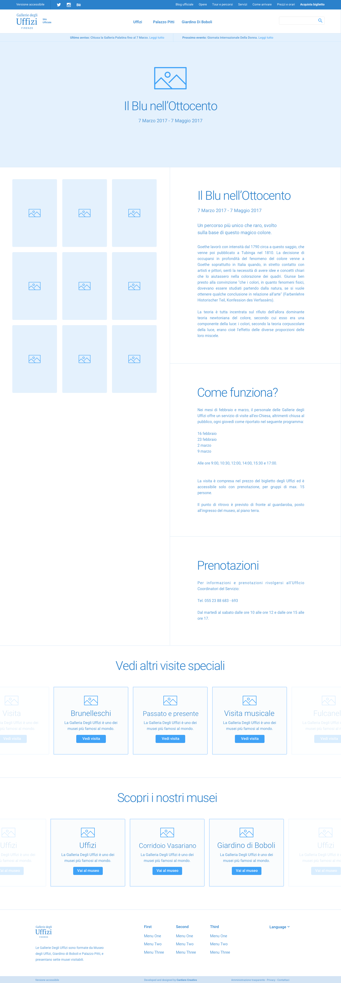
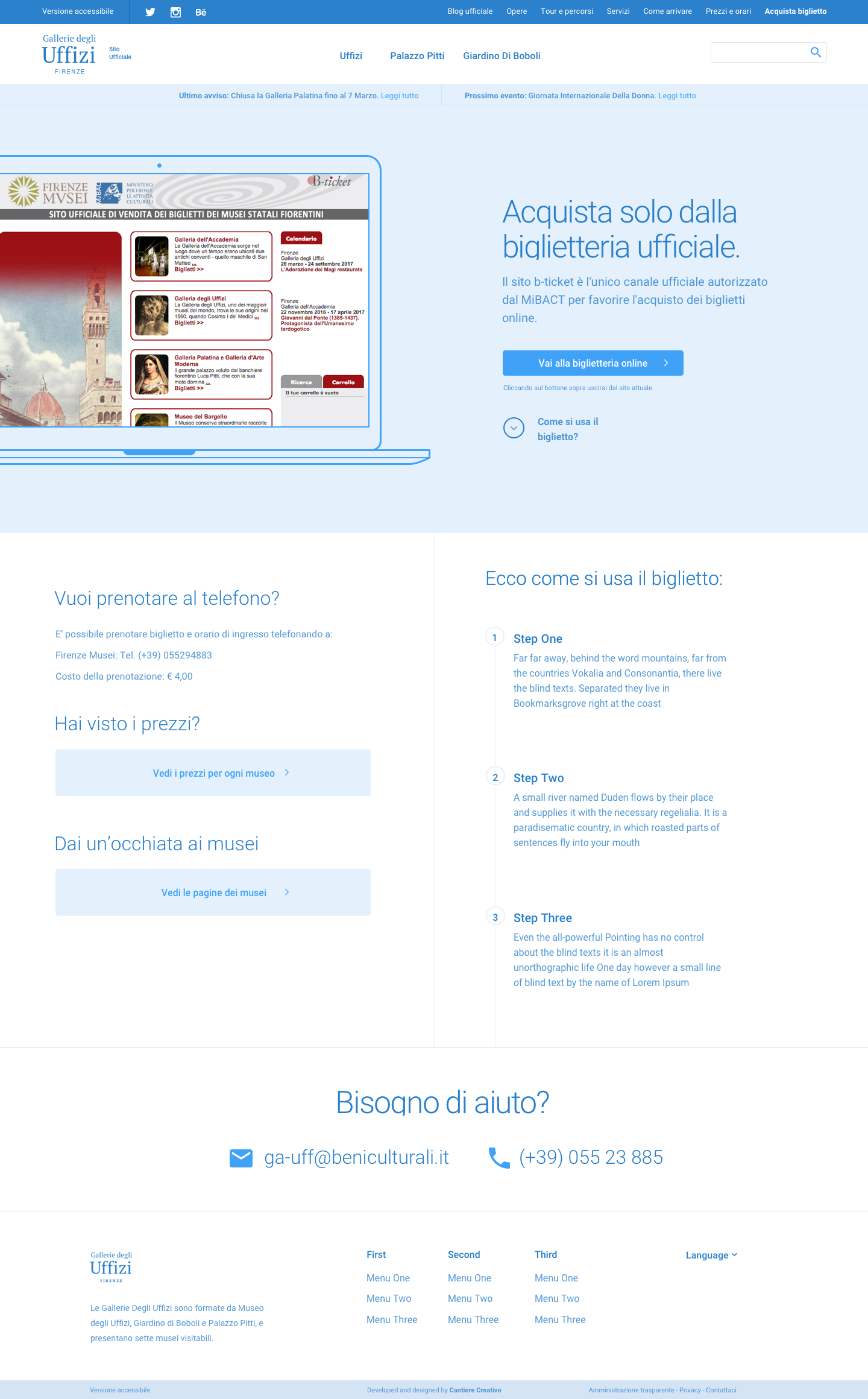
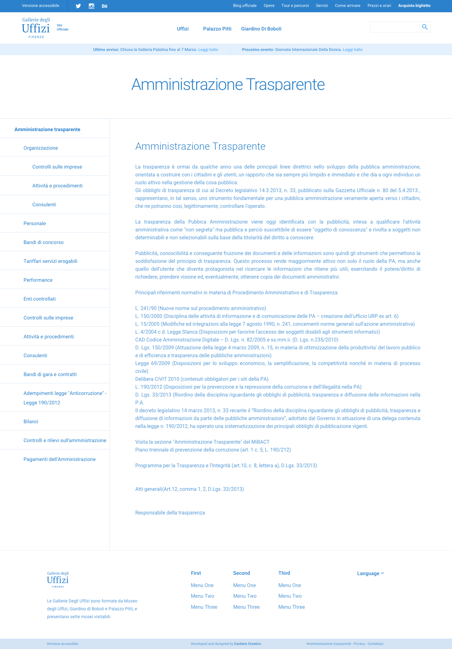
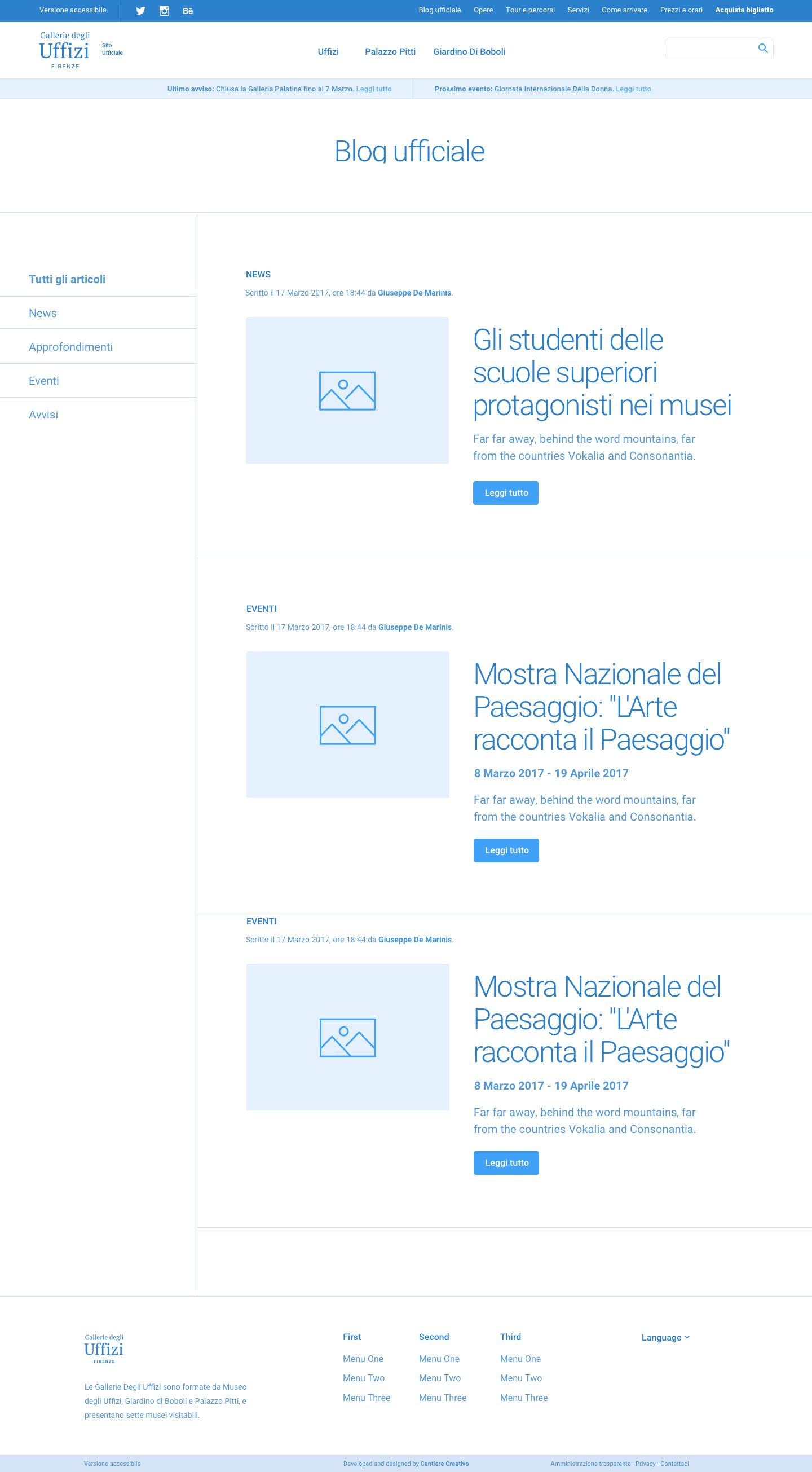
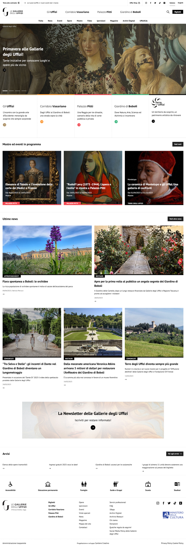
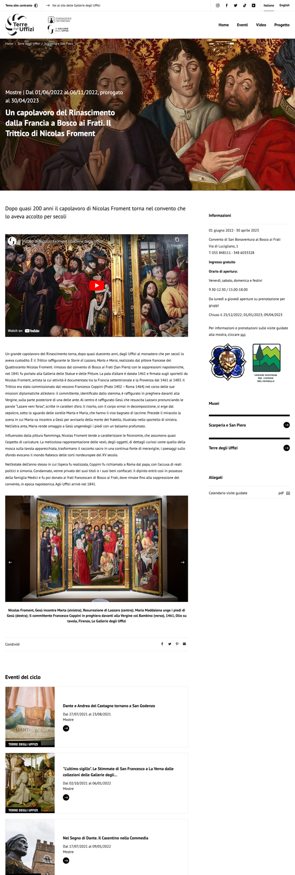
- Wireframes
- User interviews
- User testing
- Workshops
This project was delivered by Cantiere Creativo.
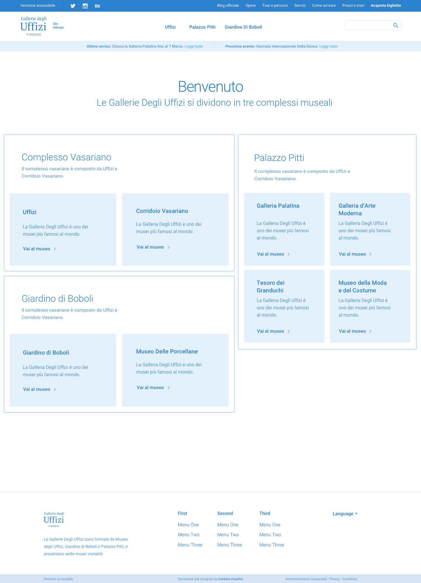
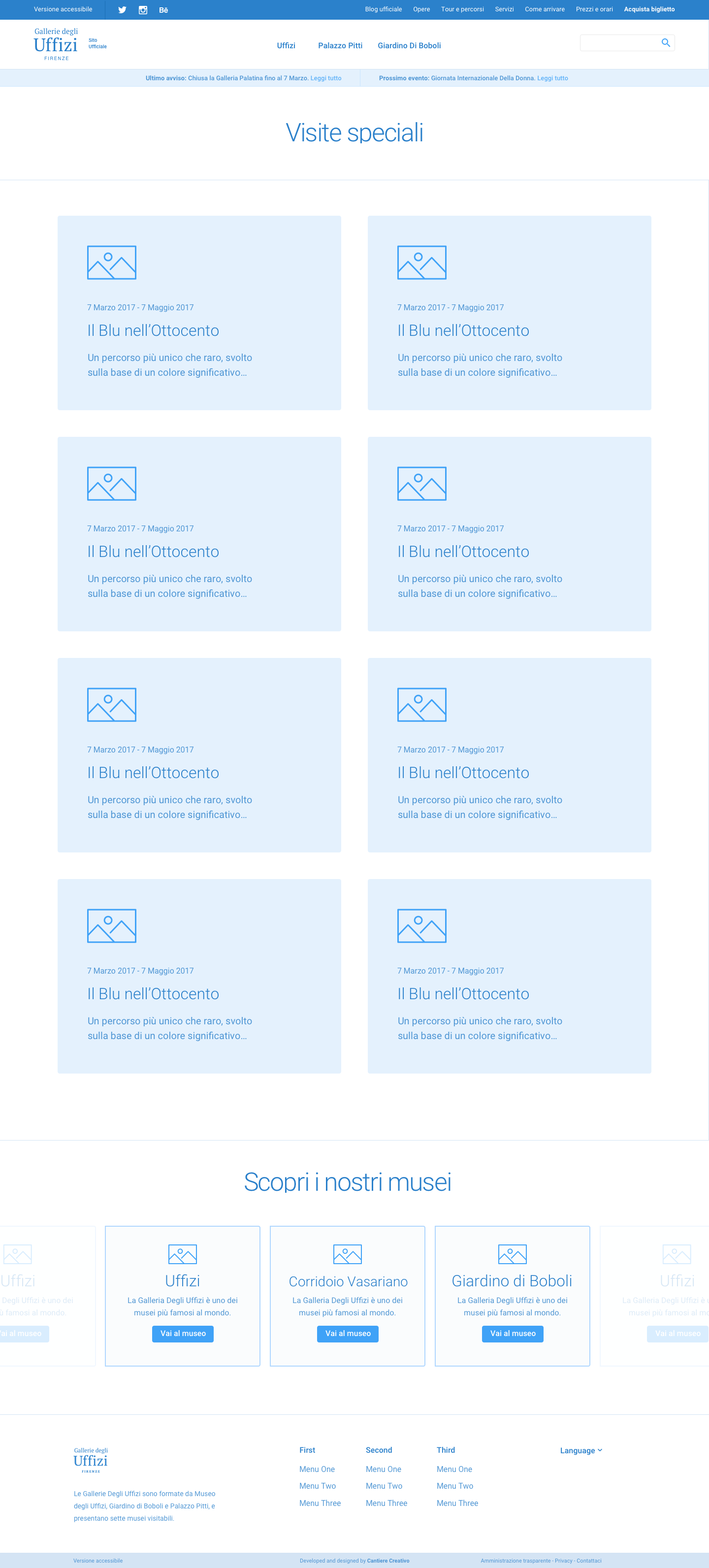
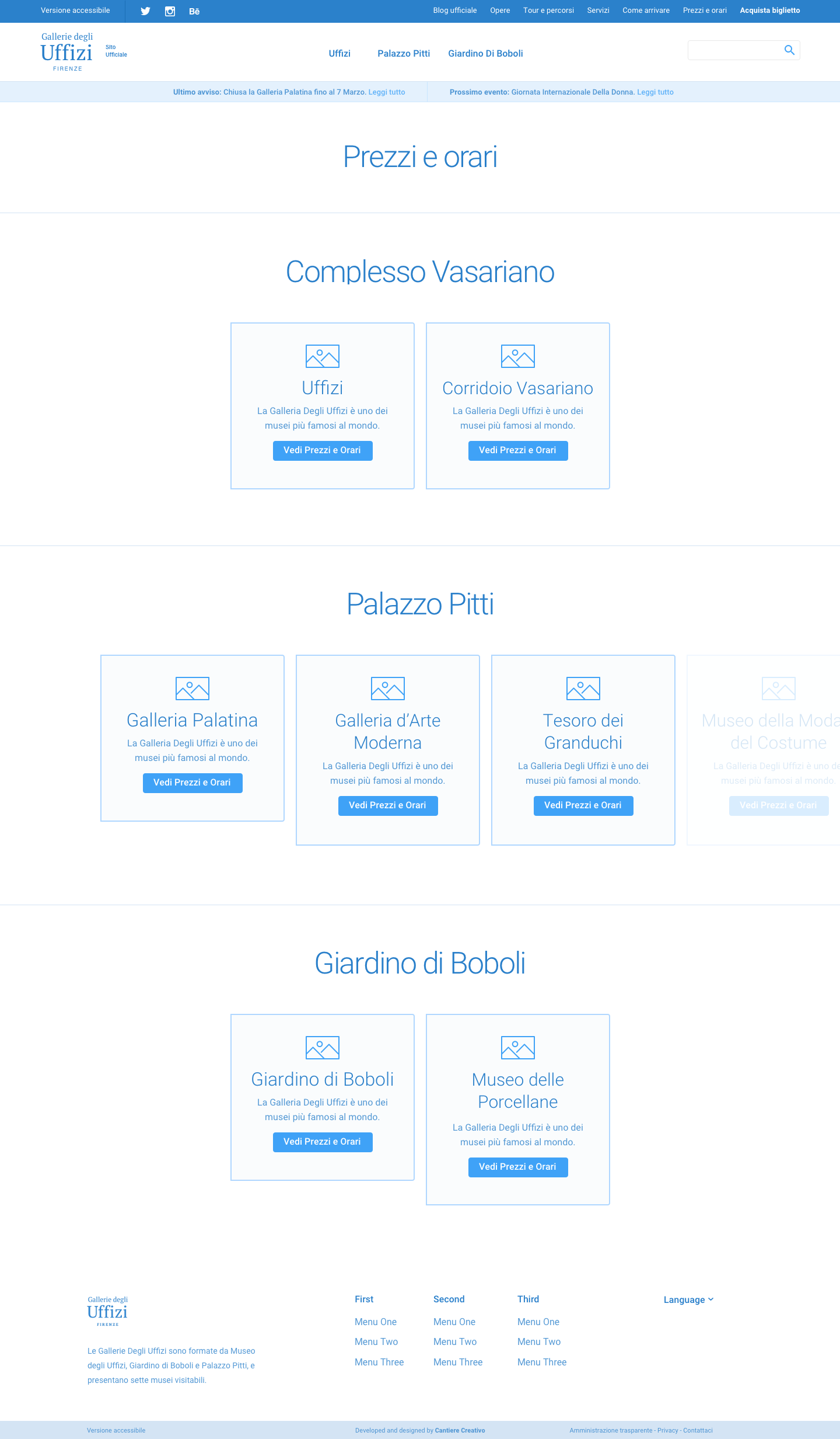
As Head of UX, I provided wireframes, conducted user interviews, performed user tests, and facilitated design thinking workshops.
+130%
in traffic
18M
visits/year
4k
users online avg
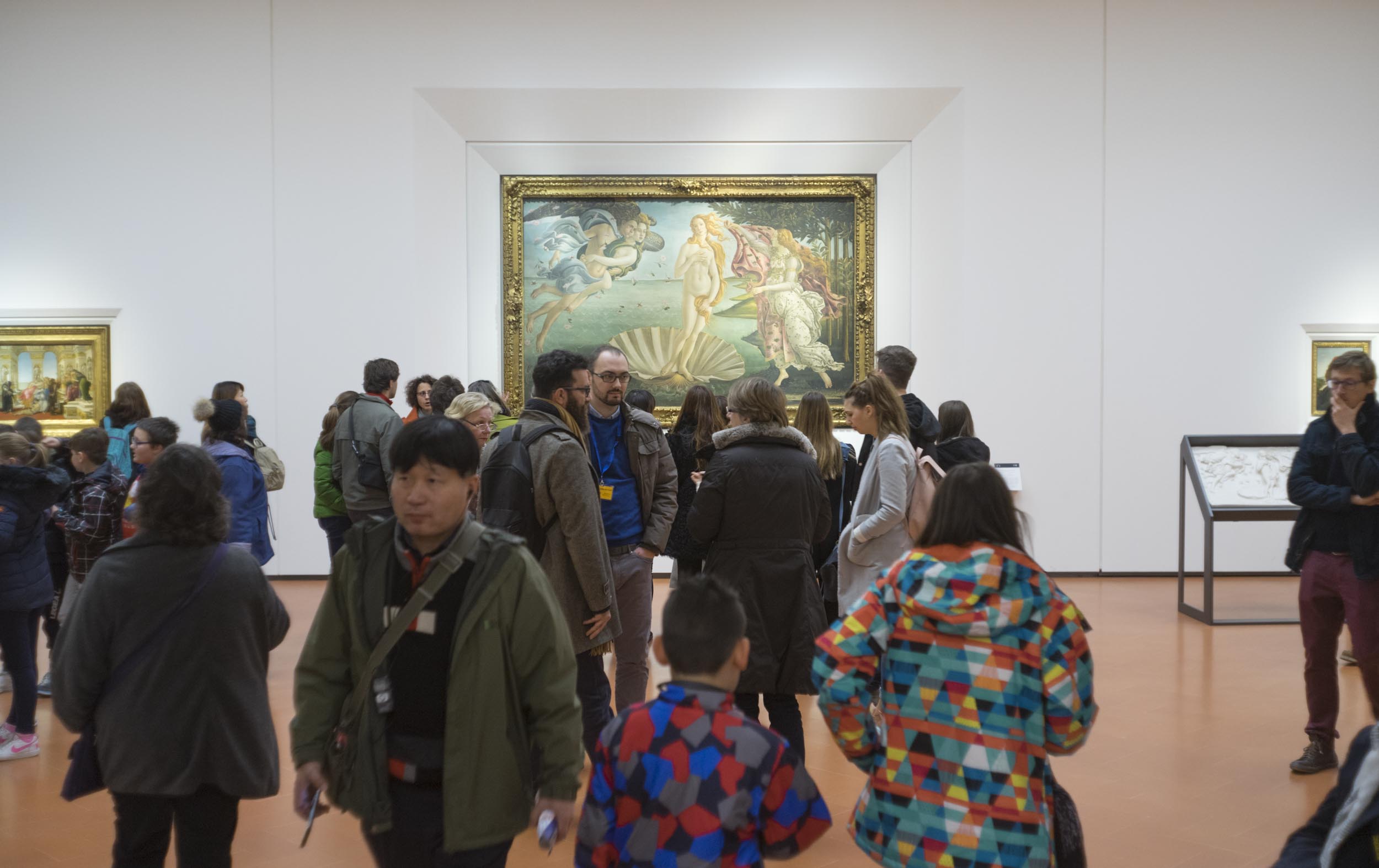
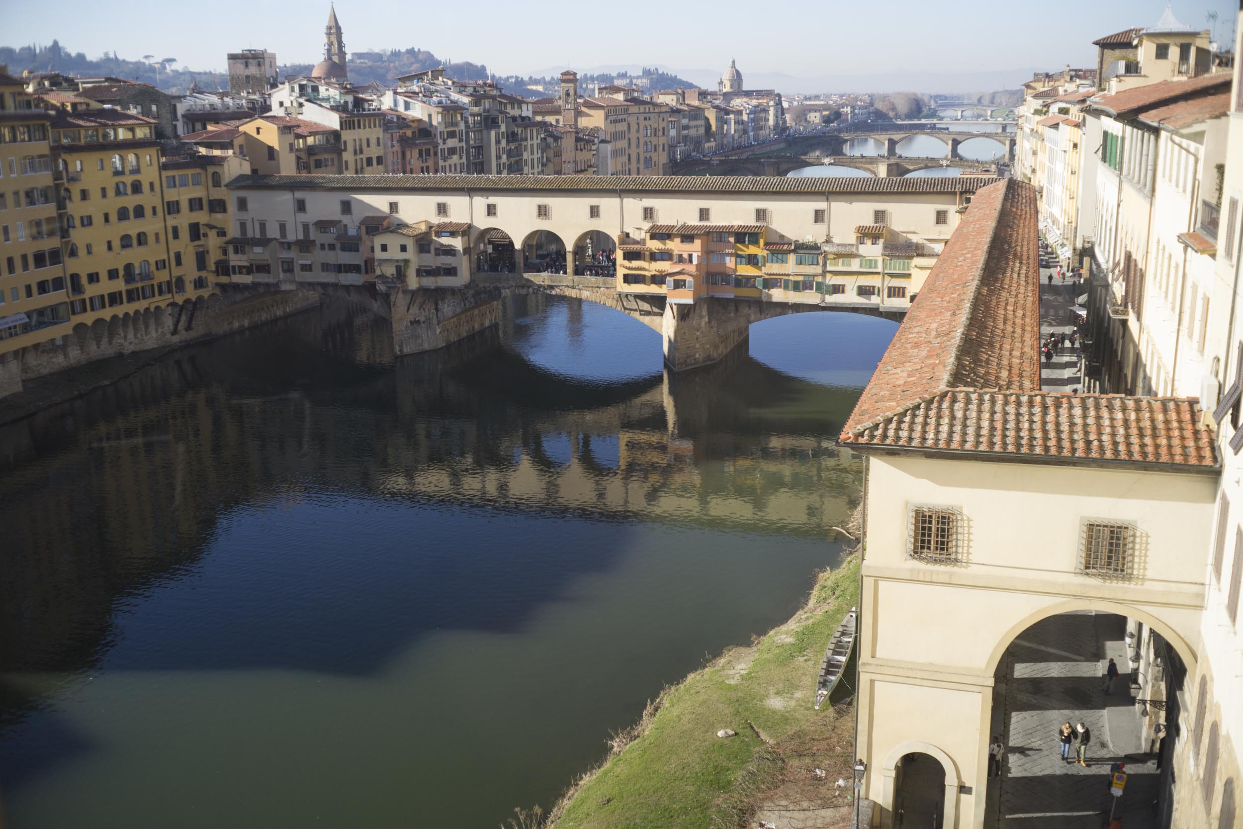
The Uffizi Gallery, in Florence, Italy, is known as one of the most famous and important art museums in the world. Founded in 1581, the Uffizi has a large collection of art by well-known artists like Botticelli, Michelangelo, and Raphael. The museum's great collection and history make it a popular place for art fans and tourists, attracting millions of visitors each year as one of the top museums in the world.
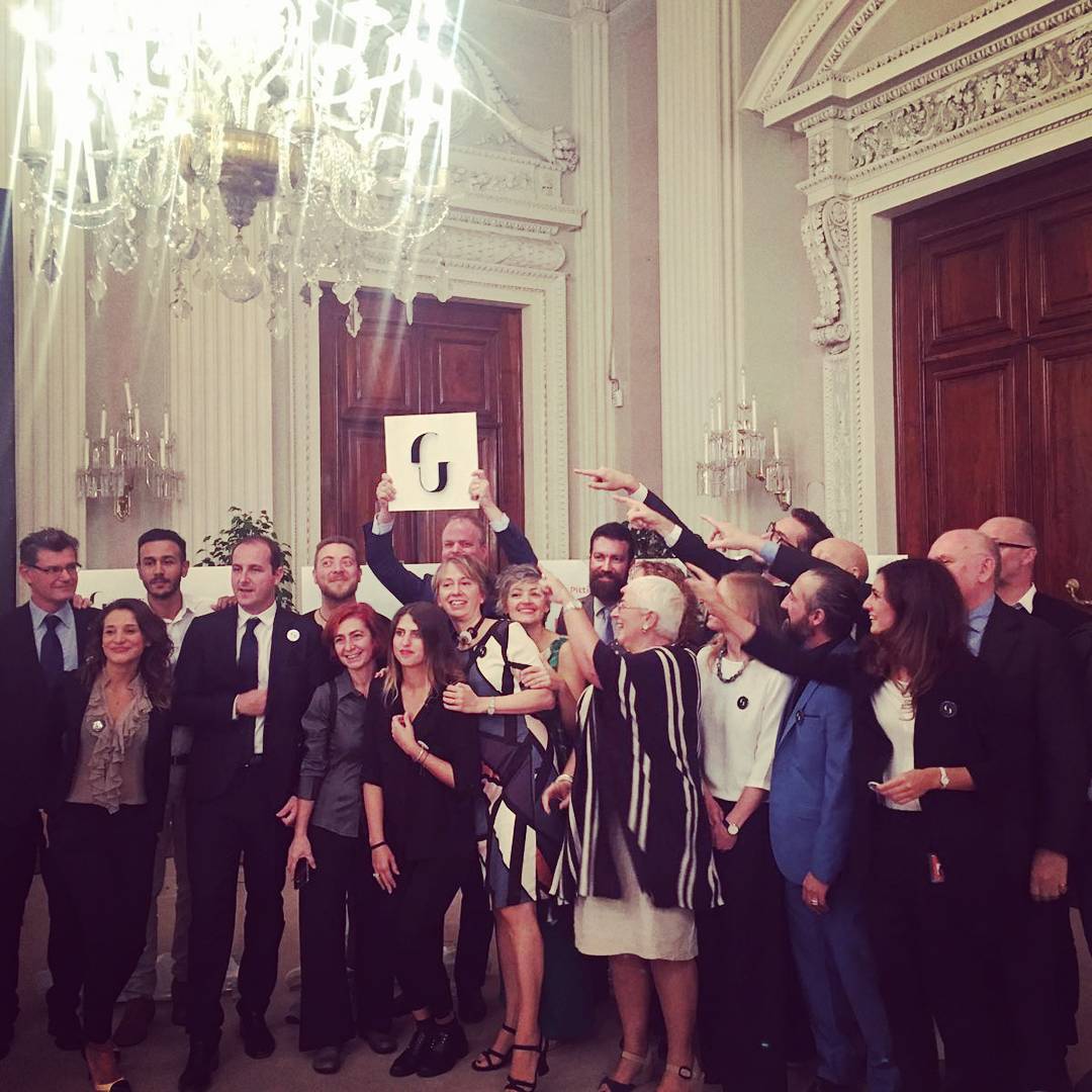
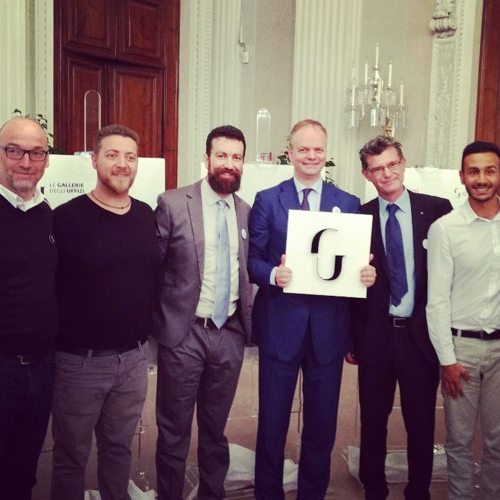
When we started working with Uffizi, they had a temporary website that didn't show their true value as one of the world's best museums. Our first challenge was to understand Uffizi's identity and values to make a website that really represented them. With help from the design agency CarmieUbertis, we made a new image for Uffizi that looked nice and showed their brand. As the Lead UX designer, my job was to make an information system that helped Uffizi's staff and visitors. This included making the ticket-buying process better, making the experience better for visitors with disabilities, and improving communication between Uffizi's departments.
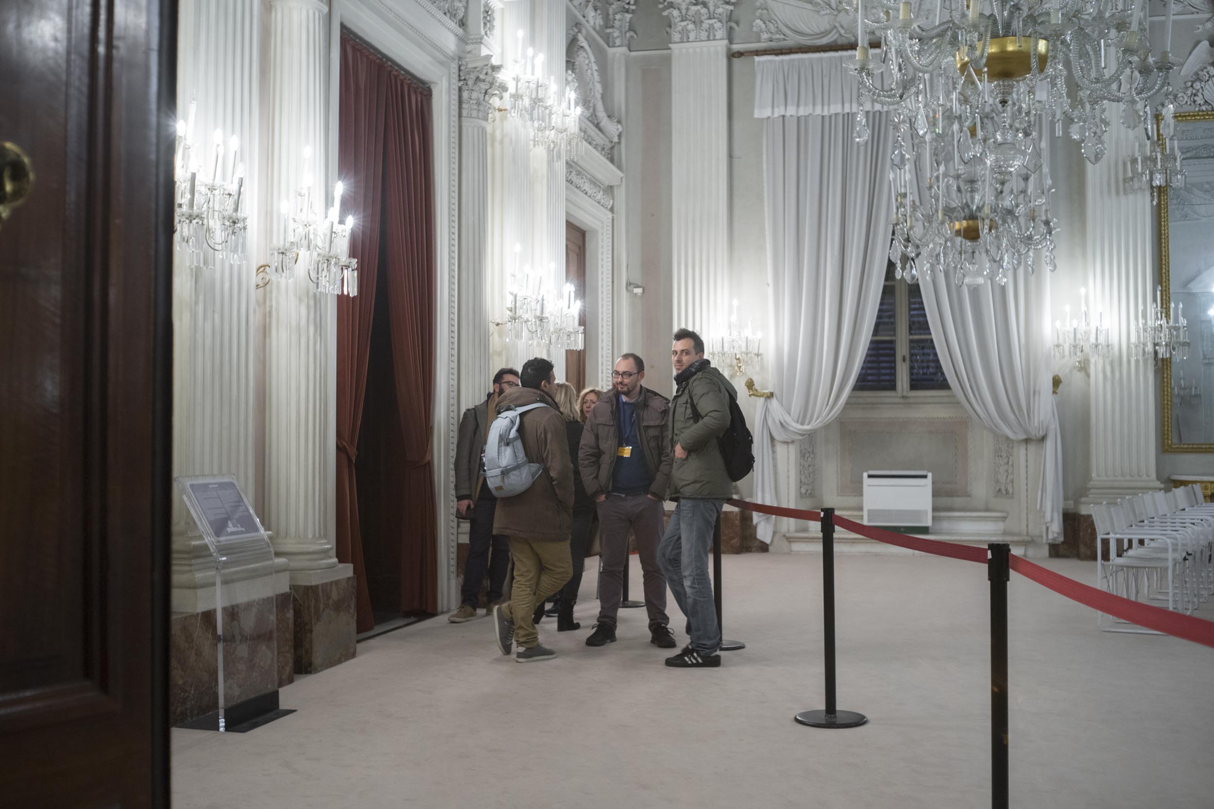
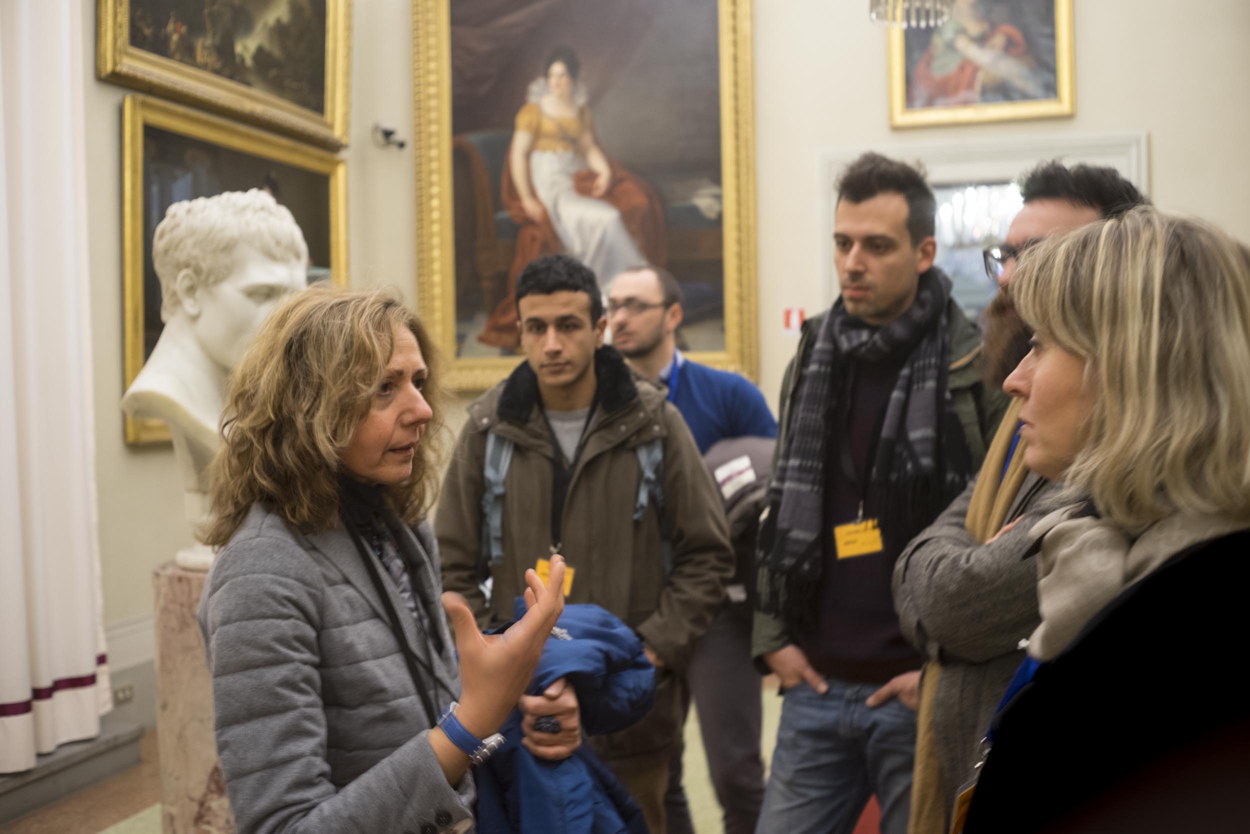
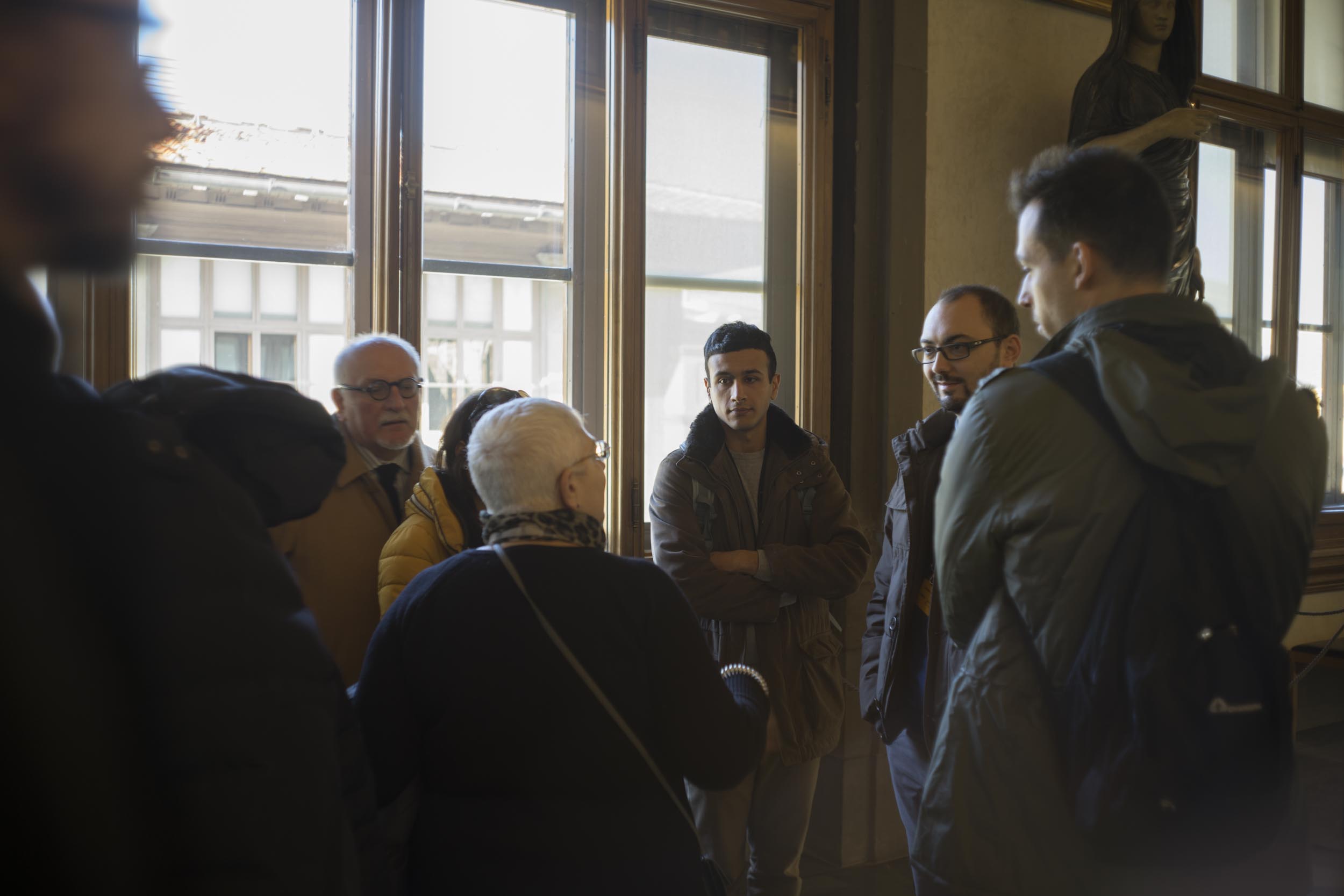
Once the project started, I led workshops with different Uffizi departments, CarmieUbertis, and our team. Since many other Uffizi departments couldn't be there, I set up two days of interviews to get information from different points of view. The workshops ended with 34 proto-personas and many documents, like user journey maps and business logic maps. Our final list of solutions became the foundation for our work.
Here is a timelapse of one of our sessions:
Kick-off workshop at Le Gallerie degli Uffizi
After we had the foundation and materials, I started working on wireframes and went through many versions. I did agile user testing (here is an Italian post explaining the method) to make sure the user flow was good. We also had many meetings with the communication office and the director.
Prototype used to test tasks' accomplishment
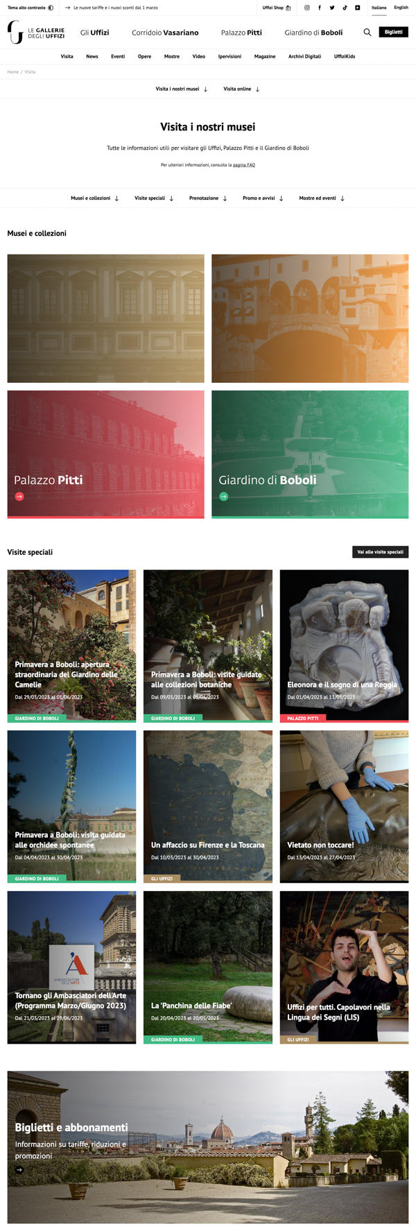
In six months, we built the final website and received good reviews from newspapers and the media:
Check Uffizi.it for the final result.
I've worked for Uffizi for many years, and my tasks after the website redesign included user tests and user research for projects like redesigning maps for Palazzo Pitti, Boboli, and Uffizi's Gallery, and many other things.
contact
Let's Work Together!
info@amirati.it
+39 3932696291
works
Other Projects
A User-Centered Dashboard for DatoCMS (and a website)
I worked on redesigning the user dashboard, analyzing personas and competitors, as well as refreshing the front website to create a more outcome-focused communication strategy.
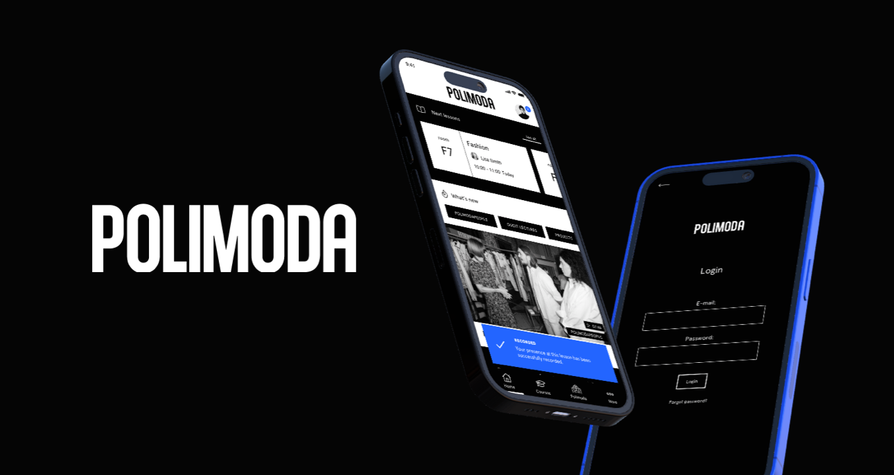
A UX Fashion Success Story for the Polimoda App
I focused on conducting extensive analysis, strategic workshops, and designing wireframes to create an app that catered to Polimoda's students and visitors while maintaining high aesthetic standards.
This is How I Designed a Real Estate Software with a Performance-Driven Method
As Head of UX, I led a comprehensive analysis, redefined the platform's performance, and designed features to improve the overall user experience, changing and enhancing the real estate agents workflow.


