- Workshops
- Wireframes
- UI Screens
This project was delivered by Cantiere Creativo.
I worked on redesigning the user dashboard, analyzing personas and competitors, as well as refreshing the front website to create a more outcome-focused communication strategy.
DatoCMS is a startup that was born in Cantiere Creativo in 2015 as an internal tool. Since becoming independent in 2019, it has grown rapidly, achieving 3.3M in revenue per year and becoming one of the biggest players in the market. DatoCMS is a headless content management system that enables users to create, manage, and distribute content across multiple platforms.
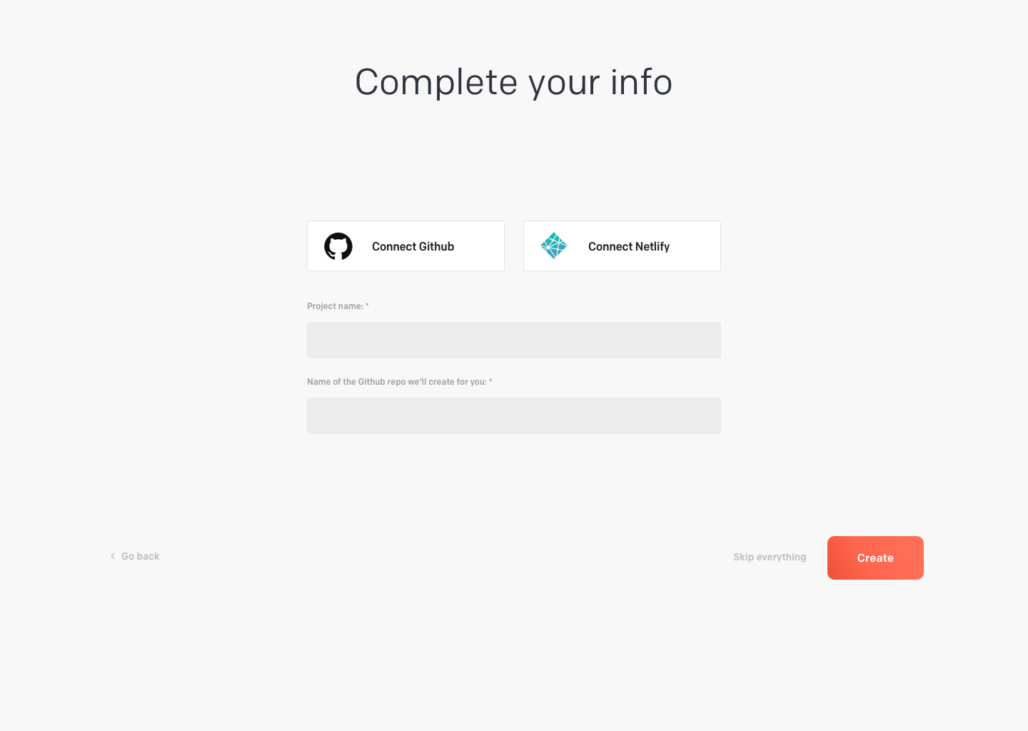
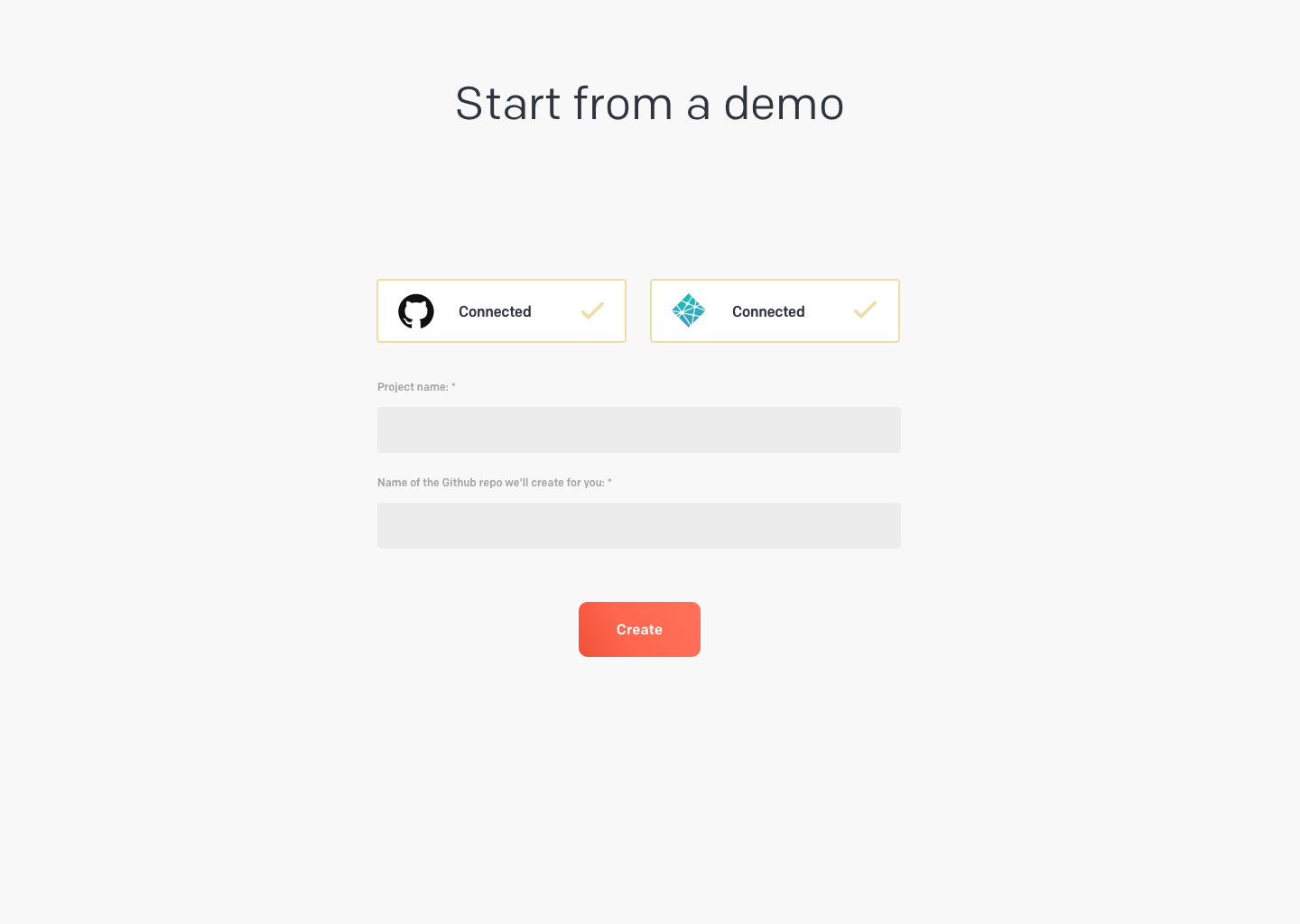
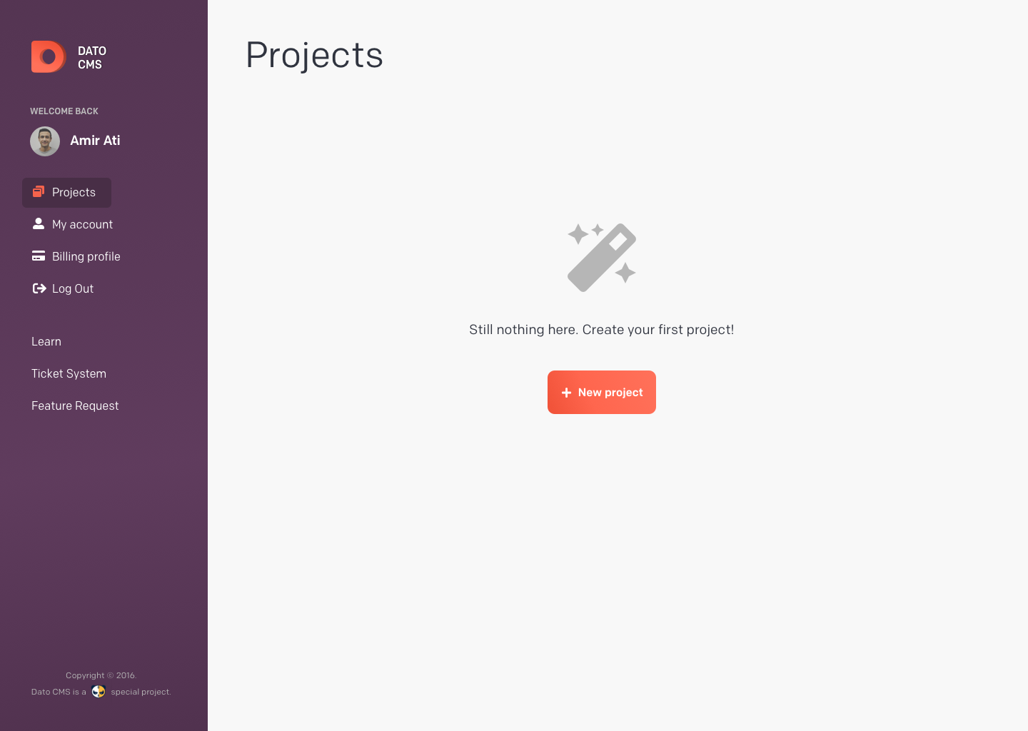
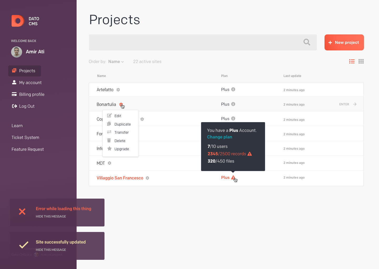
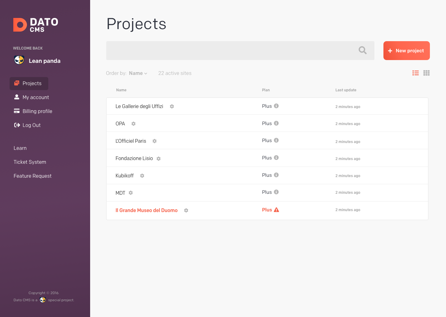
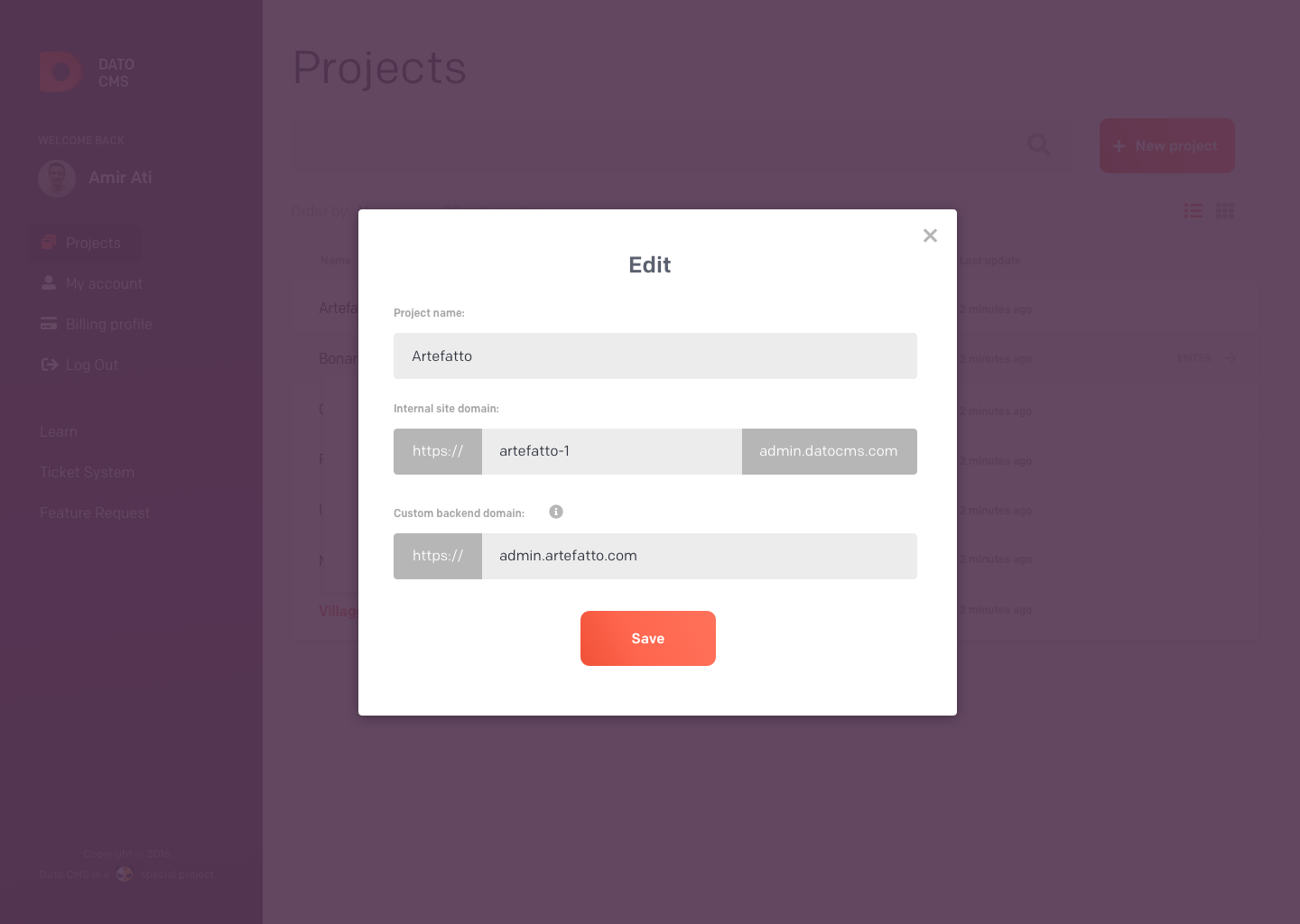
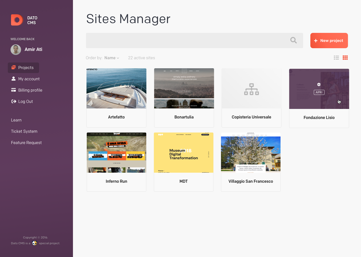
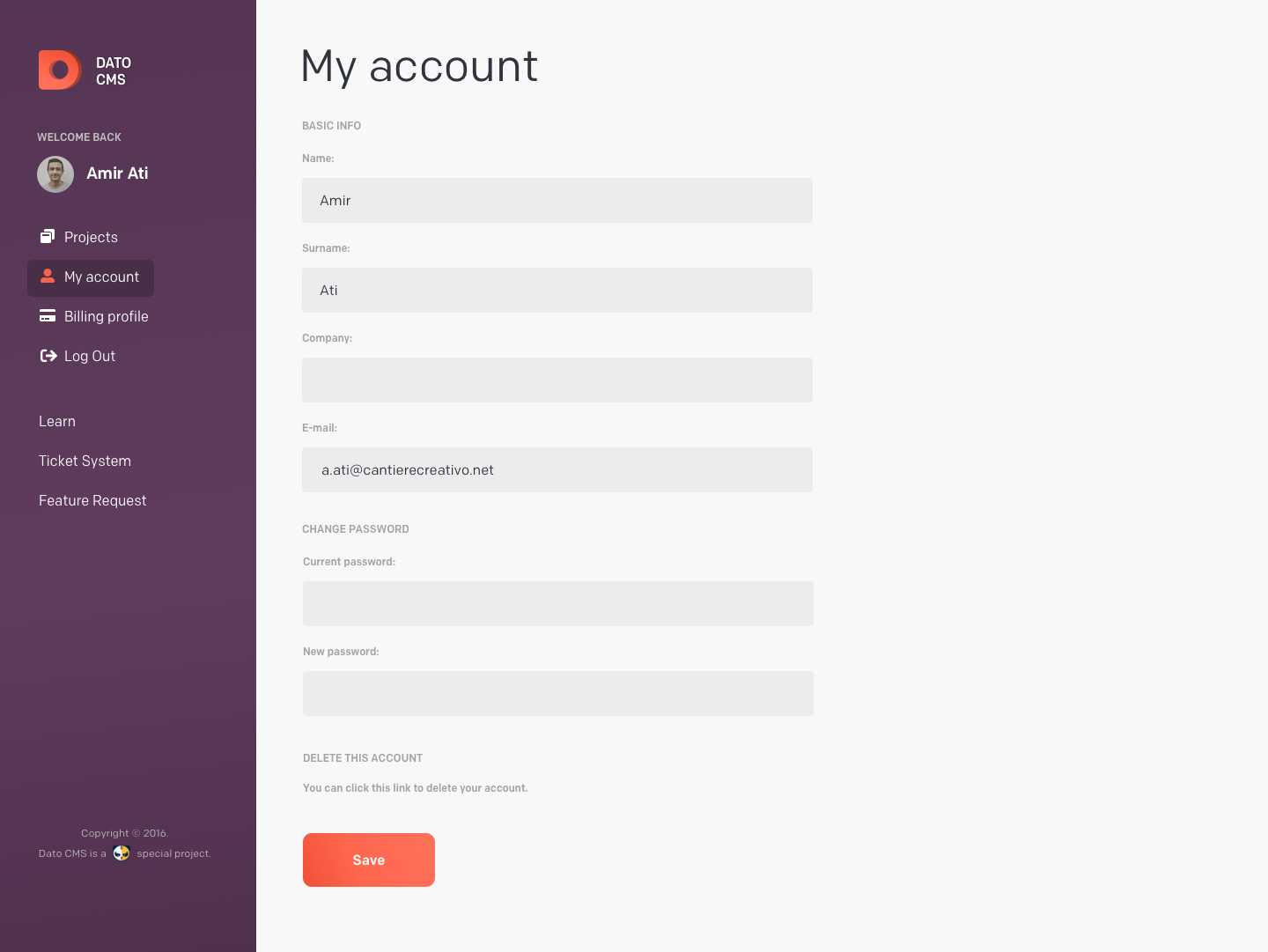
The first job I took on was redesigning the user dashboard. Initially, the plan was to revamp the entire UI of the CMS, but we decided it would be too much work. Instead, we focused on the user dashboard. While working on this, I conducted a thorough analysis of the personas, their tasks, current scenarios, and their needs. Additionally, I examined how major competitors catered to these users and addressed their problems.
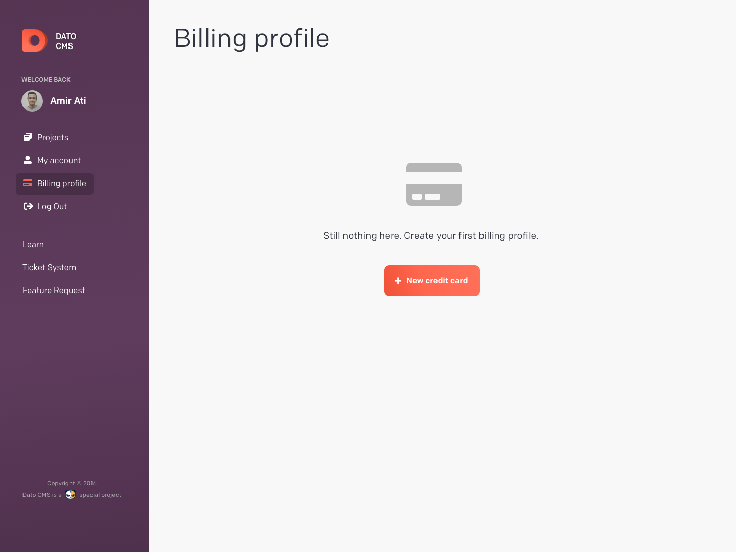
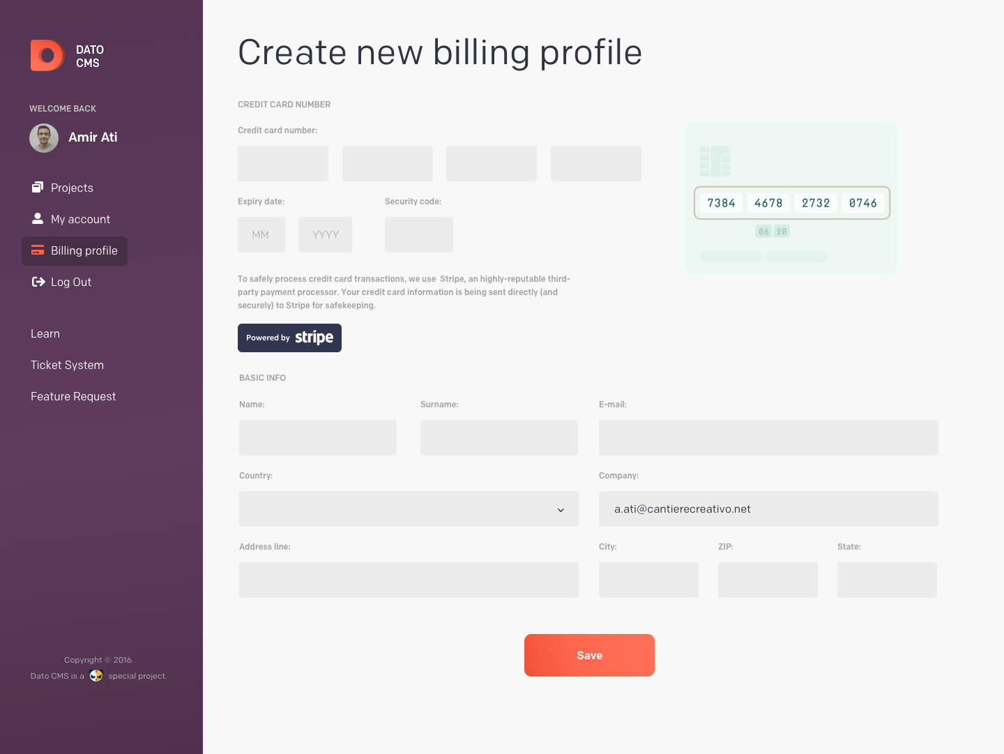
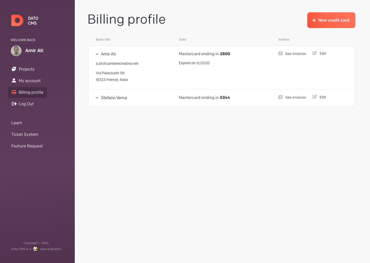
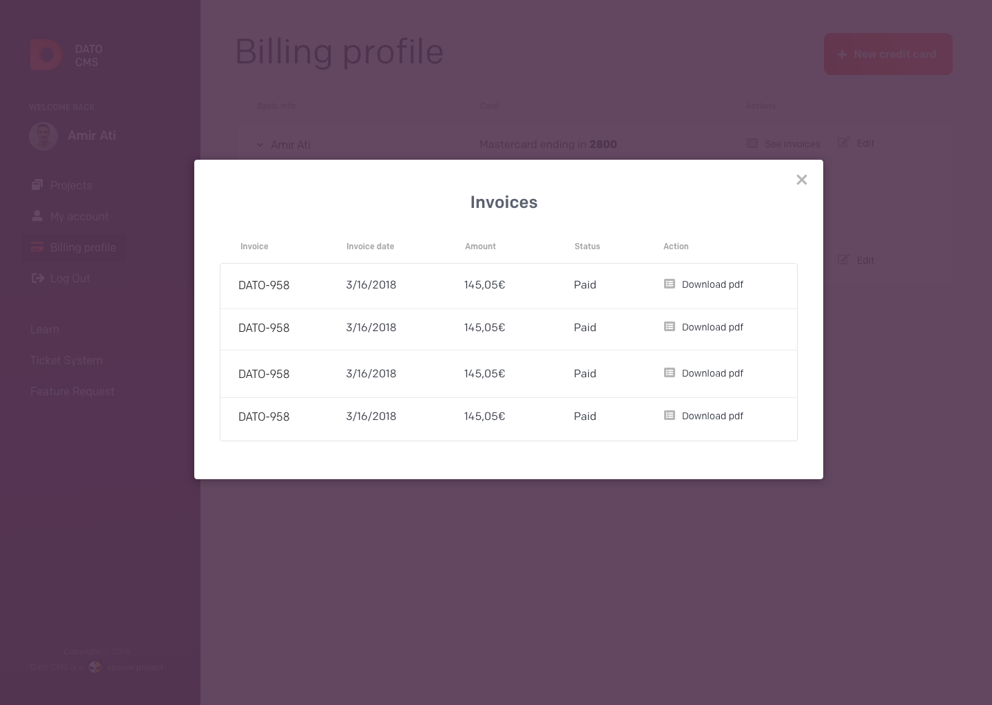
This was the final design of the user dashboard:
The second job was to renew the front website. The challenge was to shift communication towards outcomes rather than outputs, targeting not only developers but also other audience segments identified earlier. I carried out an extensive competitor analysis, examining the choices made by others on each page. We reused the proto-personas created in previous workshops.
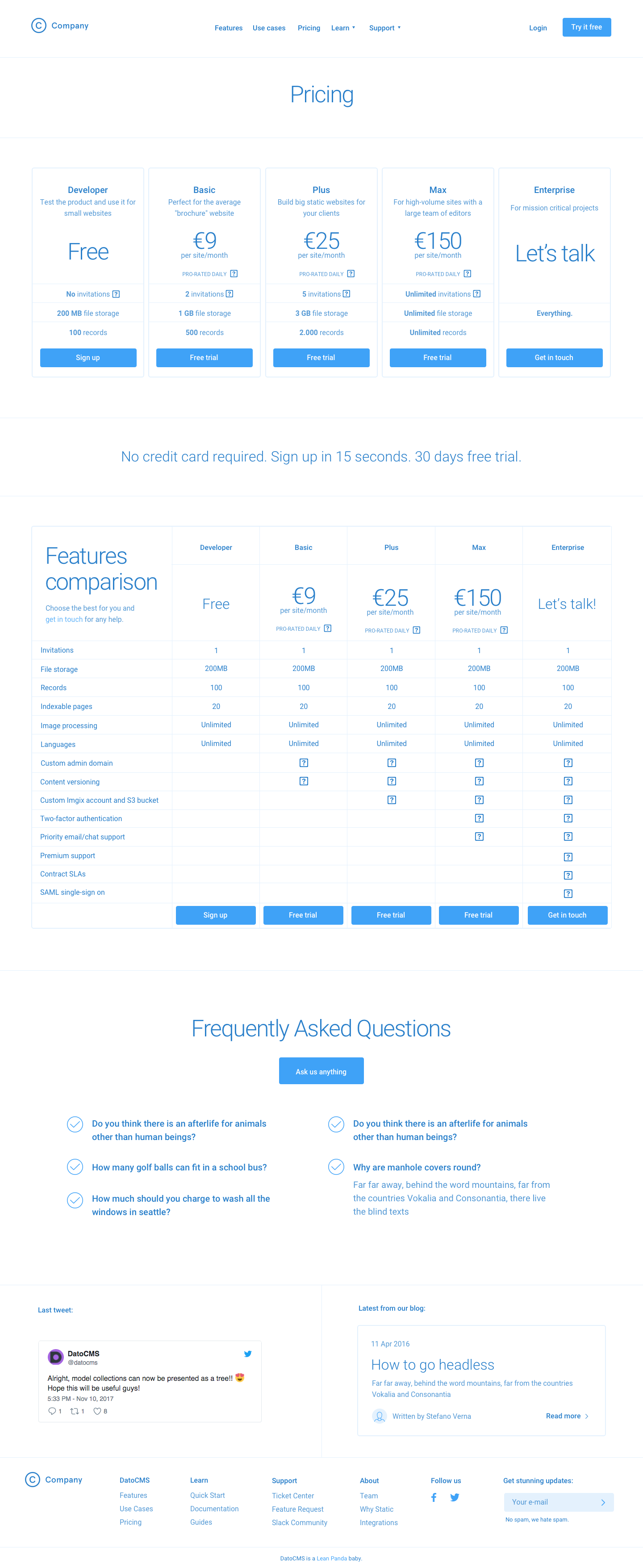
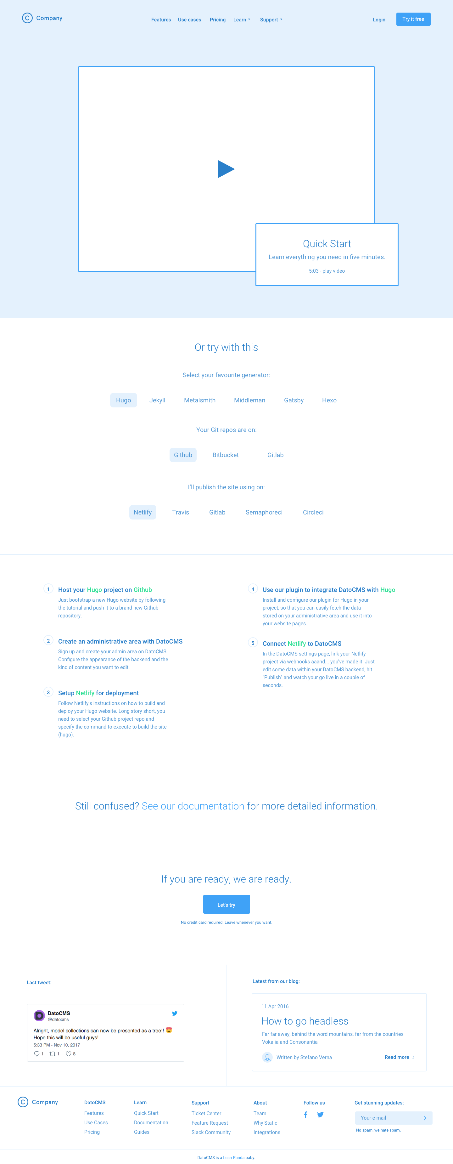
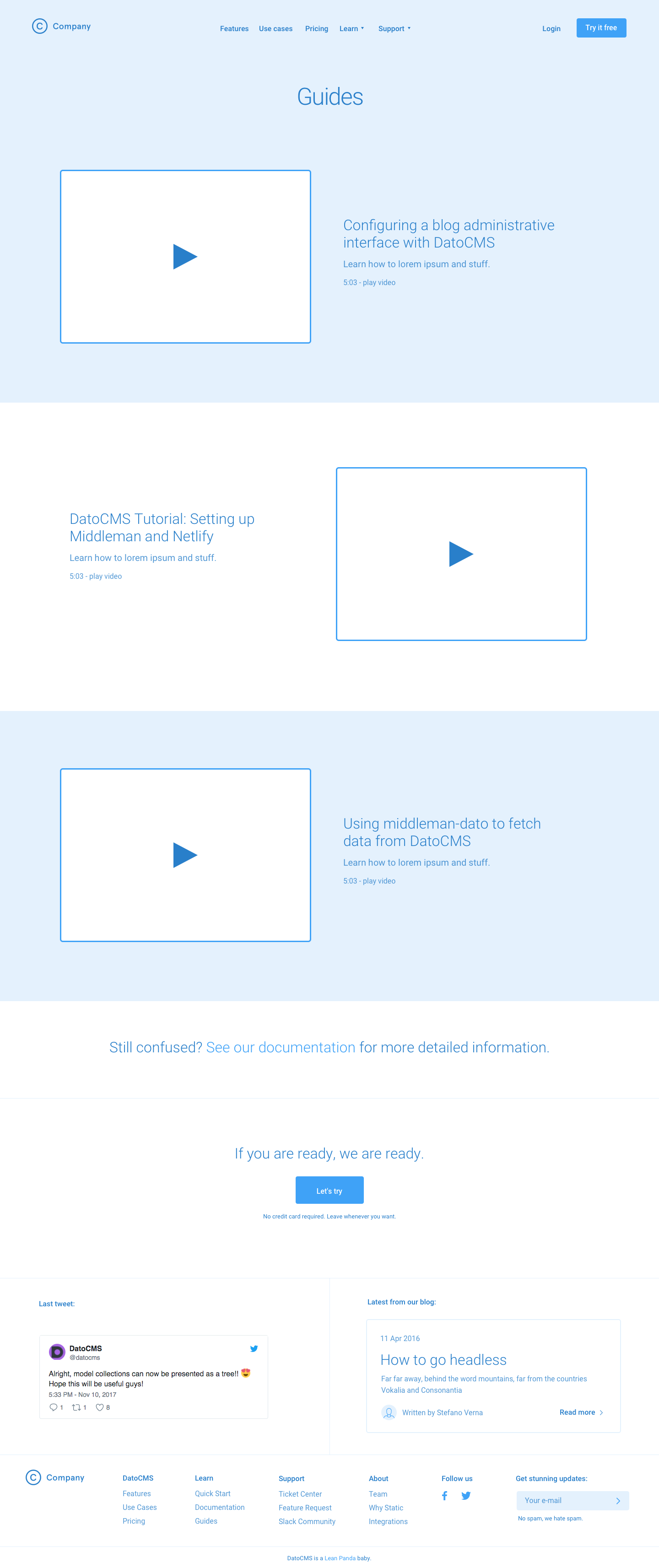
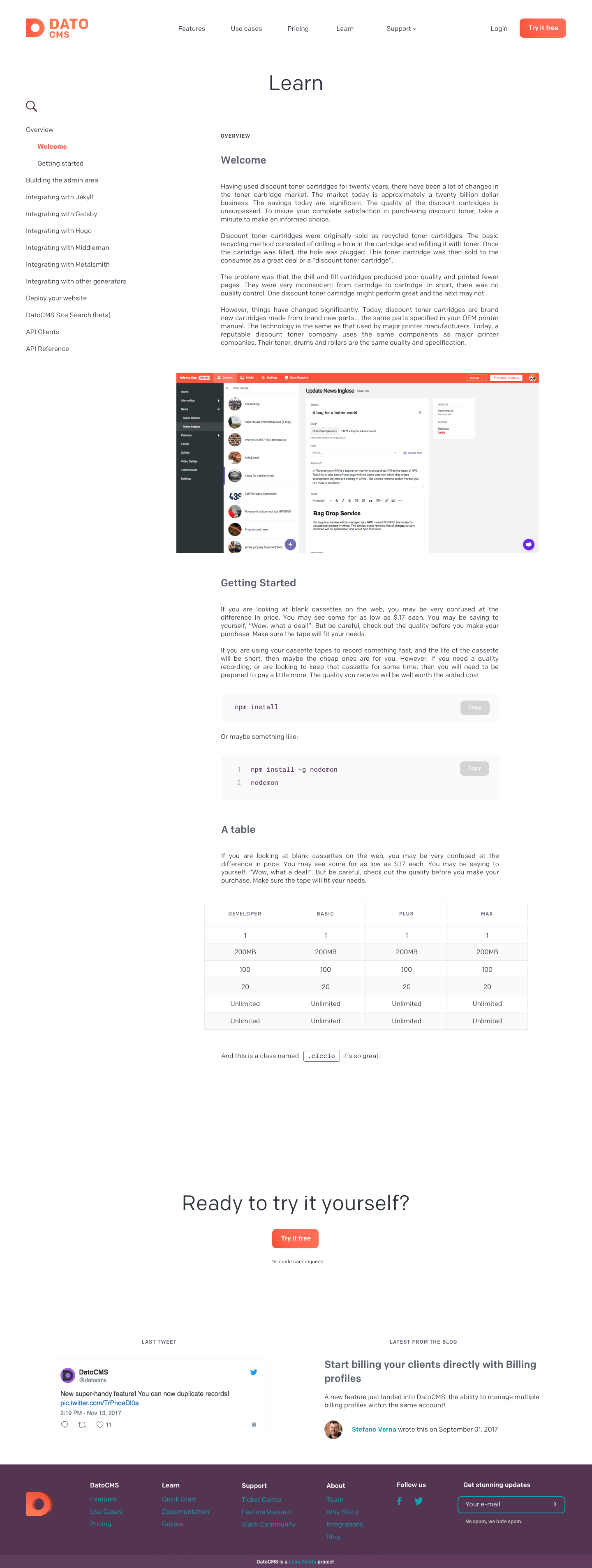
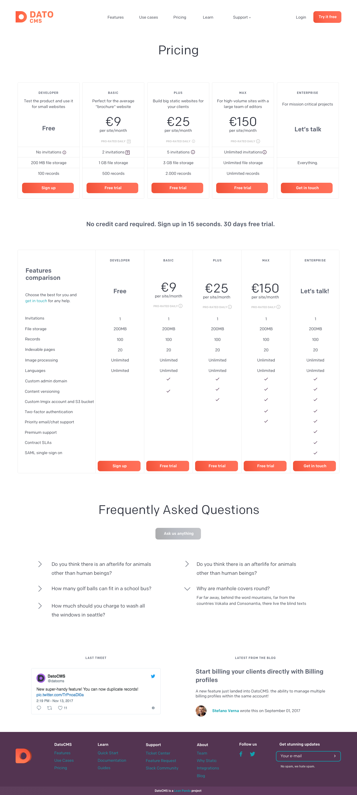
Here are the wireframes:
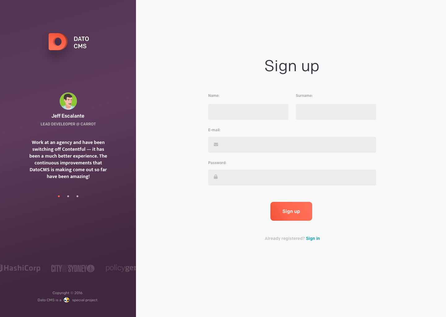
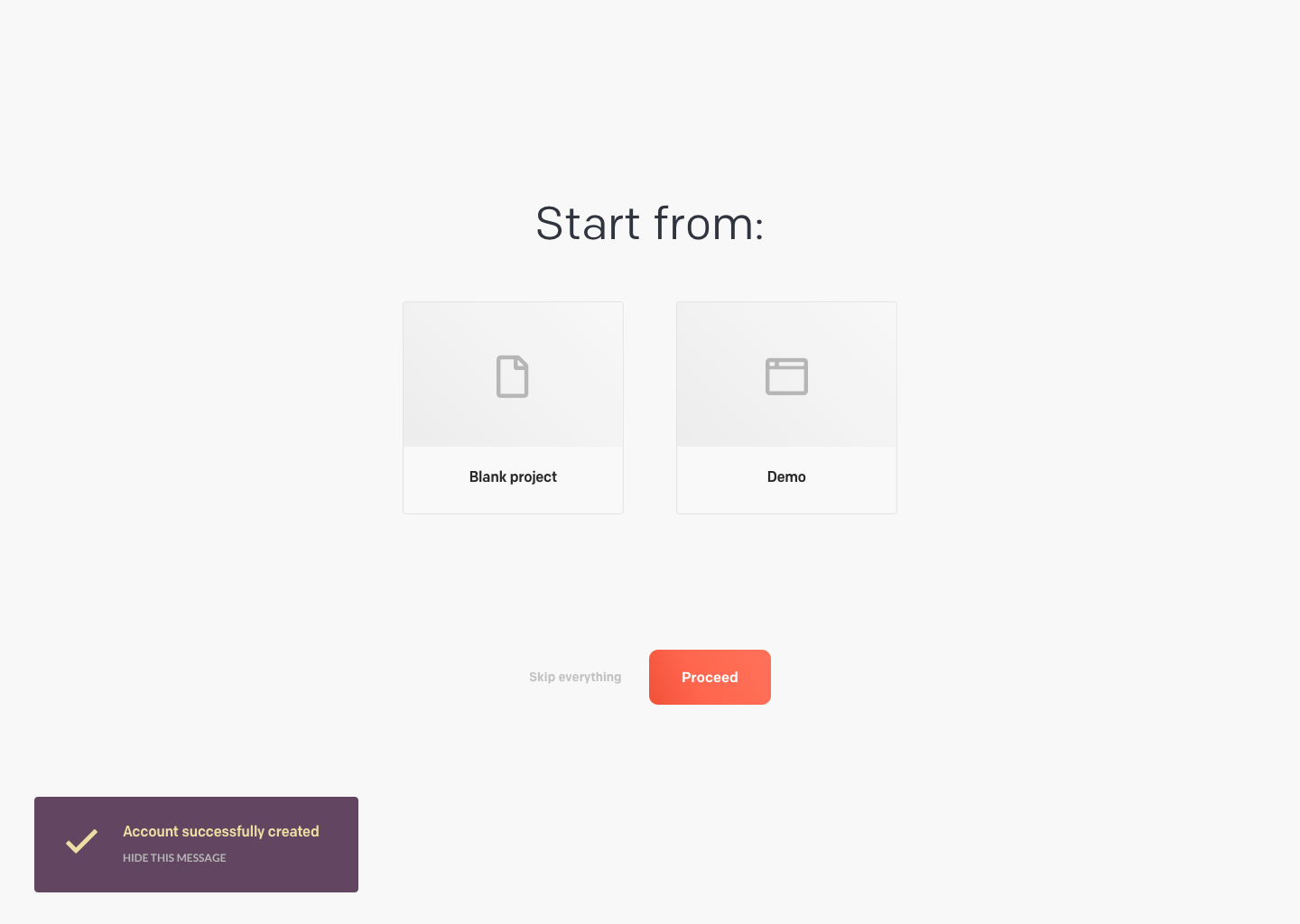
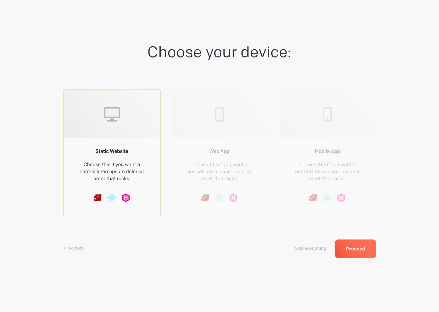
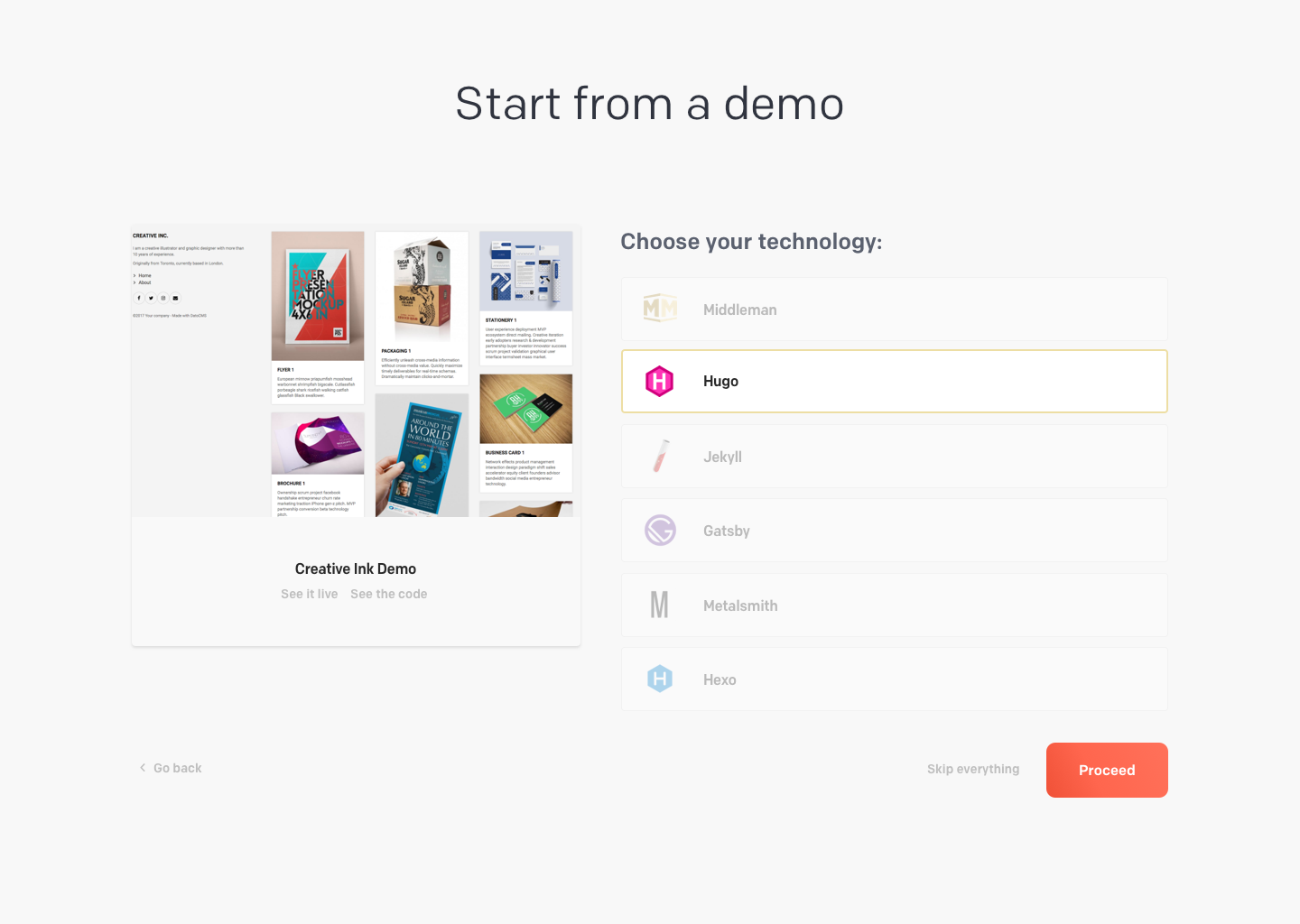
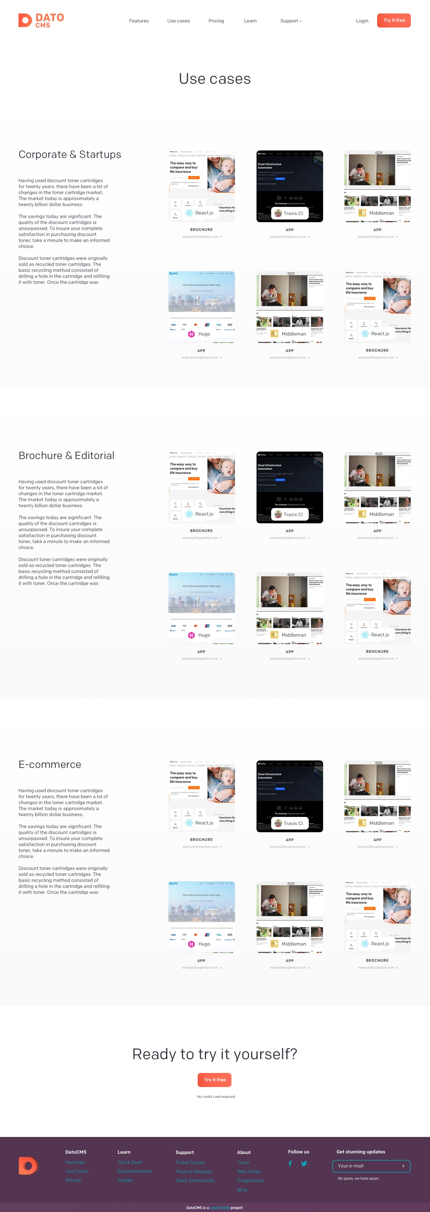
In this case, I also designed the entire website based on my wireframes:
I am truly inspired by DatoCMS's journey as a product that started from nothing and has become one of the best players in the market. It has provided me with valuable insights while working with different startups and a realistic perspective on the many aspects of a growing SaaS company.
Check out how it is doing right now!
contact
Let's Work Together!
info@amirati.it
+39 3932696291
works
Other Projects
Redesigning the Uffizi Museum's Online Experience
As Head of UX, I provided wireframes, conducted user interviews, performed user tests, and facilitated design thinking workshops.
A UX Fashion Success Story for the Polimoda App
I focused on conducting extensive analysis, strategic workshops, and designing wireframes to create an app that catered to Polimoda's students and visitors while maintaining high aesthetic standards.
This is How I Designed a Real Estate Software with a Performance-Driven Method
As Head of UX, I led a comprehensive analysis, redefined the platform's performance, and designed features to improve the overall user experience, changing and enhancing the real estate agents workflow.


