- Workshops
- Interviews
- Wireframes
This project was delivered by Cantiere Creativo.
I focused on conducting extensive analysis, strategic workshops, and designing wireframes to create an app that catered
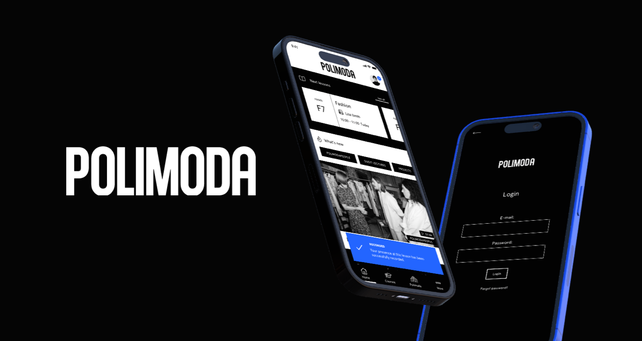
to Polimoda's students and visitors while maintaining high aesthetic standards.
Polimoda, a prestigious fashion school in Florence, Italy, is renowned for its excellent education and significant influence in the fashion industry. With a reputation for shaping the future of fashion and nurturing exceptional talent, Polimoda's impact is evident in its growing number of successful graduates and global recognition.
The challenge in designing an app for Polimoda was to create a visually appealing and user-friendly experience that met the high aesthetic standards of the fashion world while remaining simple and accessible for students and visitors. The app needed to serve the needs of Polimoda's diverse student body and provide useful information for visitors.
The first step in the process was an extensive analysis and strategic work. I conducted numerous workshops at Polimoda's beautiful campus, and the initial analysis phase lasted more than a month. One of the main challenges during the workshops was aligning the different opinions of various departments. As a result, we established a clear understanding of our goals and identified the problems we needed to solve.
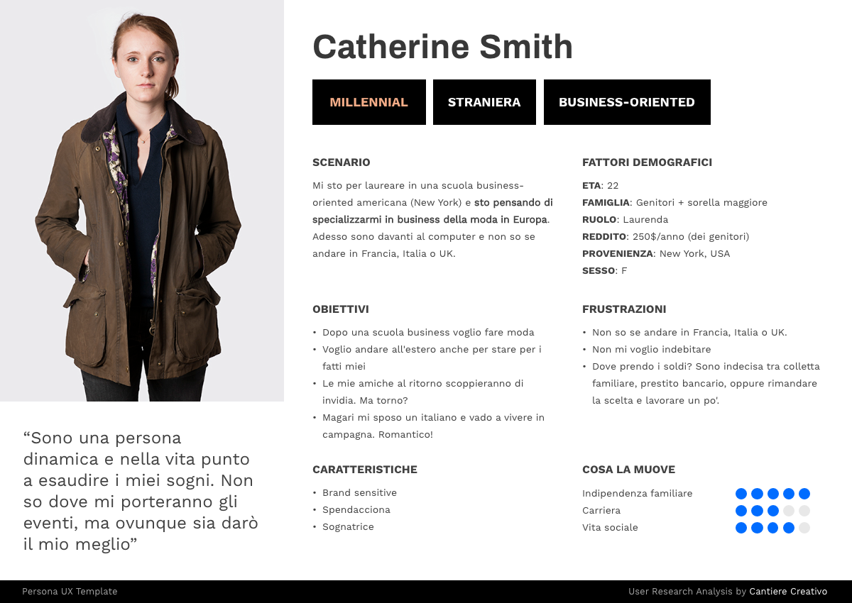
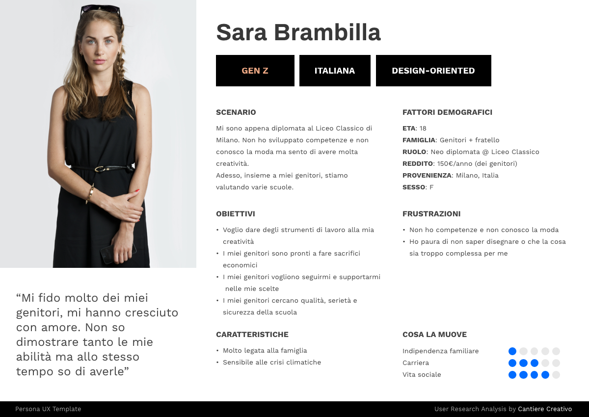
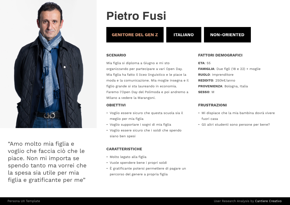
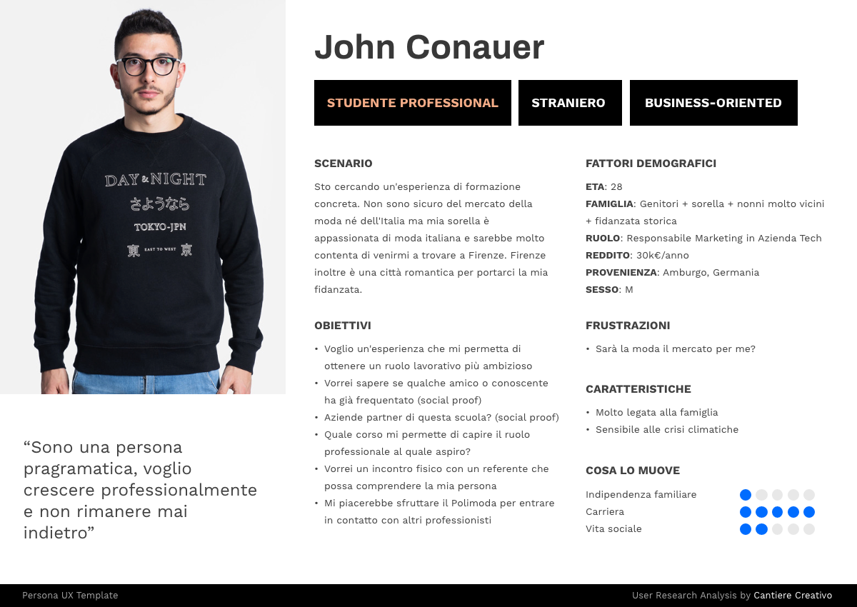
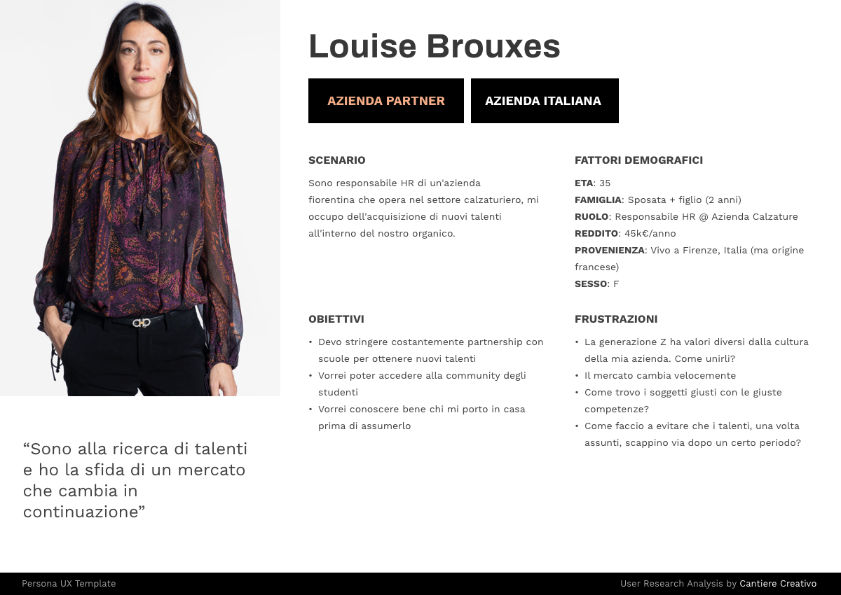
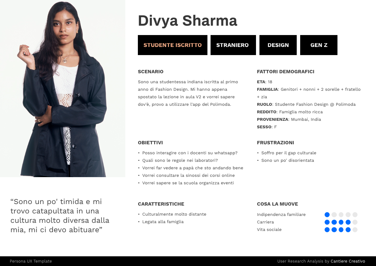
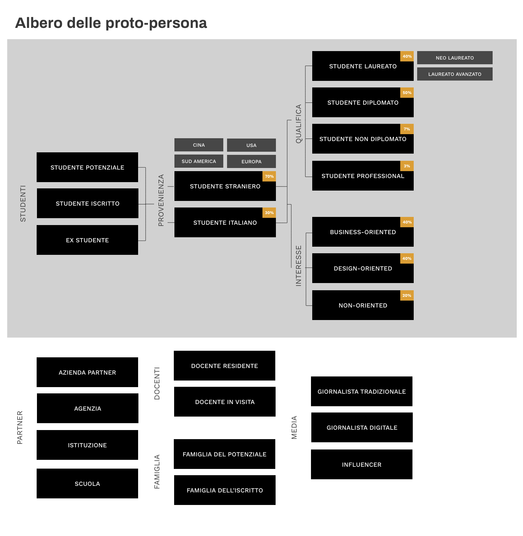
We also developed a detailed analysis of our proto-personas (only in italian):
After gaining a comprehensive overview of the proto-personas, we conducted interviews with Polimoda students who would be using the internal app. These interviews were carried out using precise protocols that Cantiere Creativo had adopted after years of trials and are well-known within the user research community. Unfortunately, due to privacy reasons, I am unable to publish our final presentation, which includes the gathered and processed data.
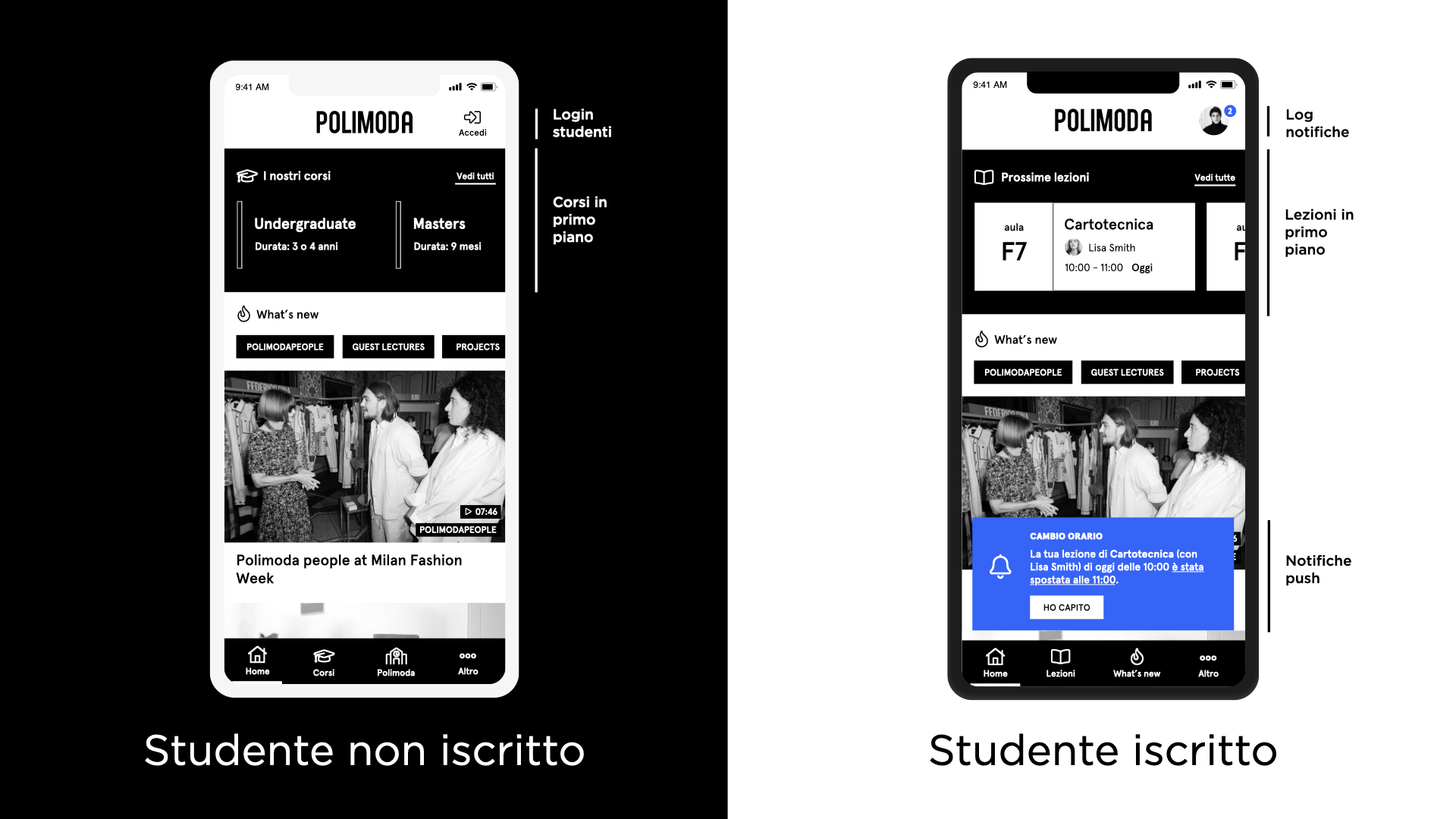
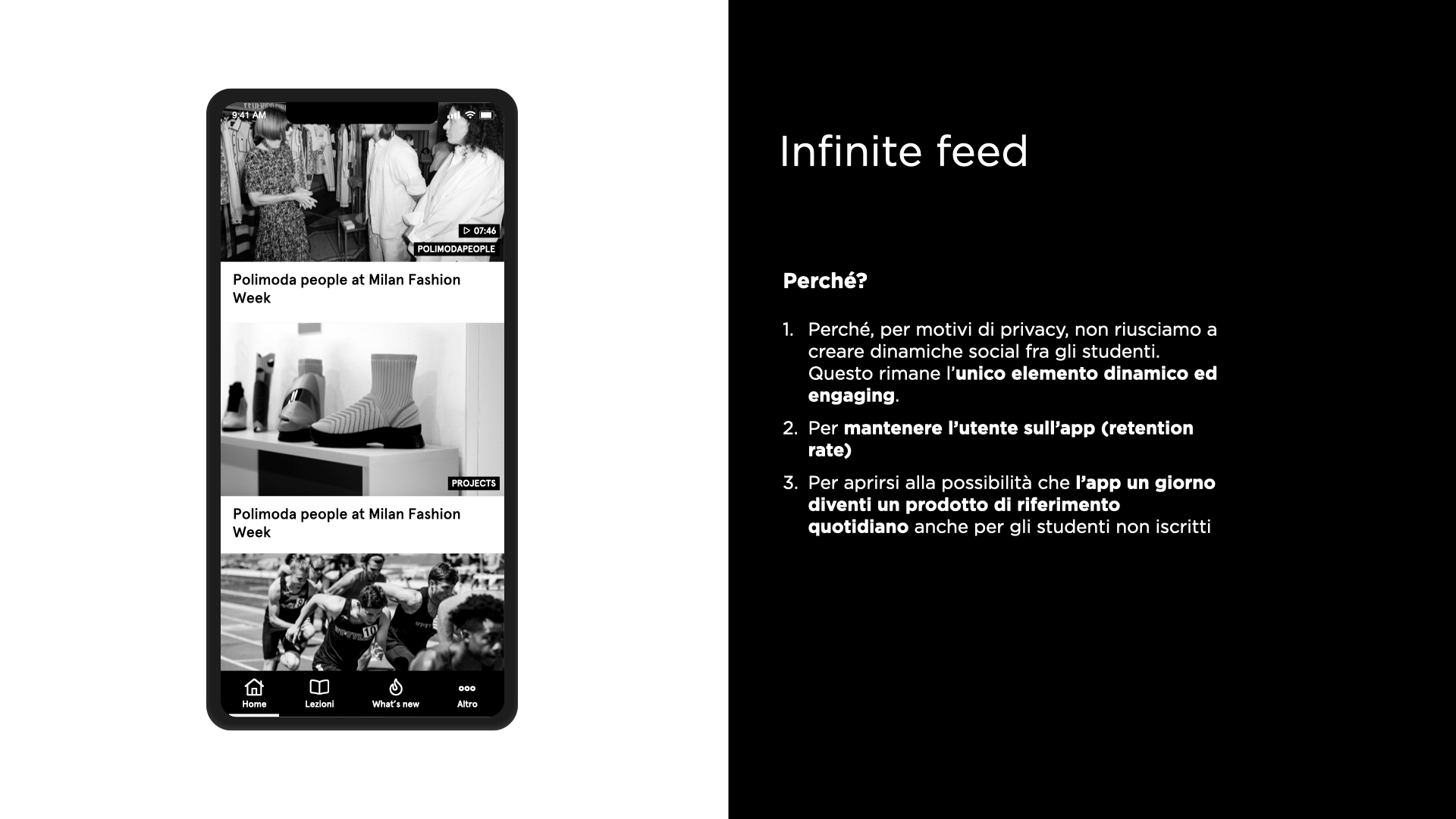
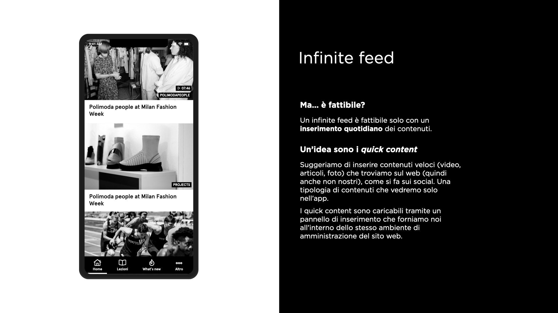
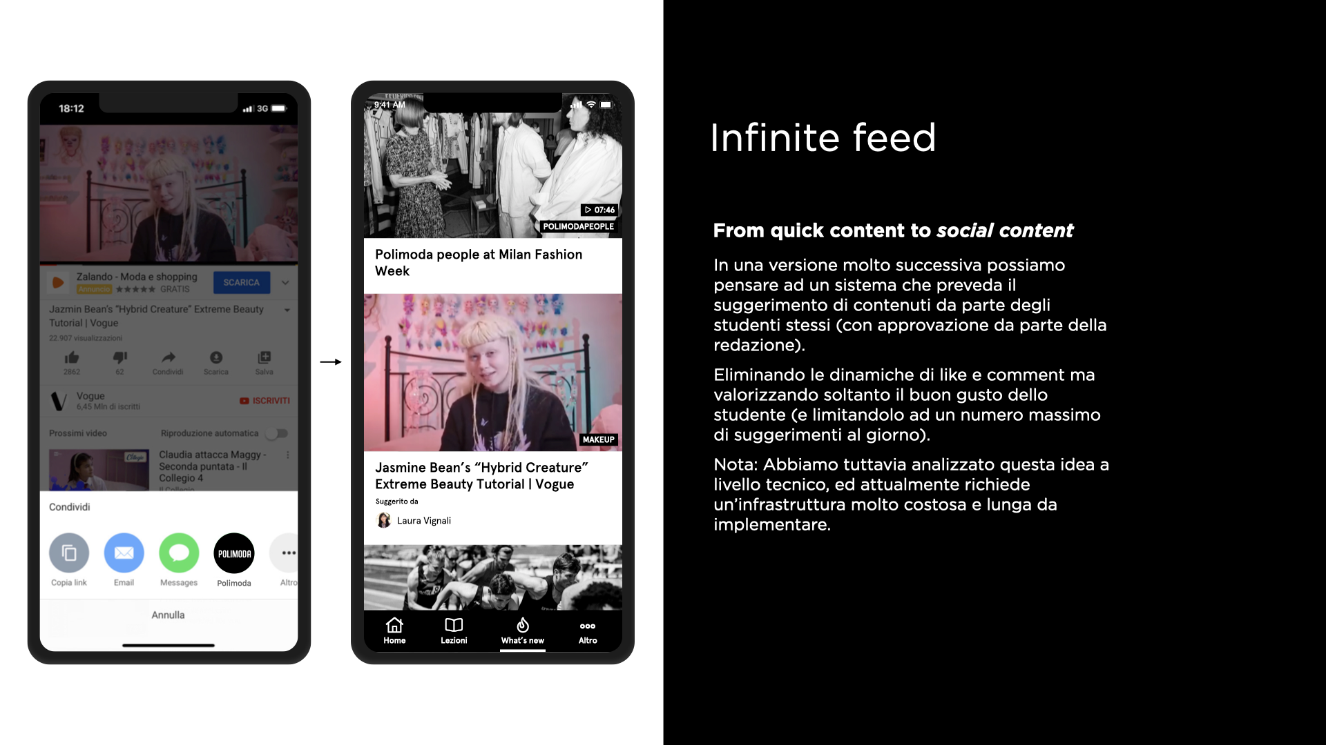
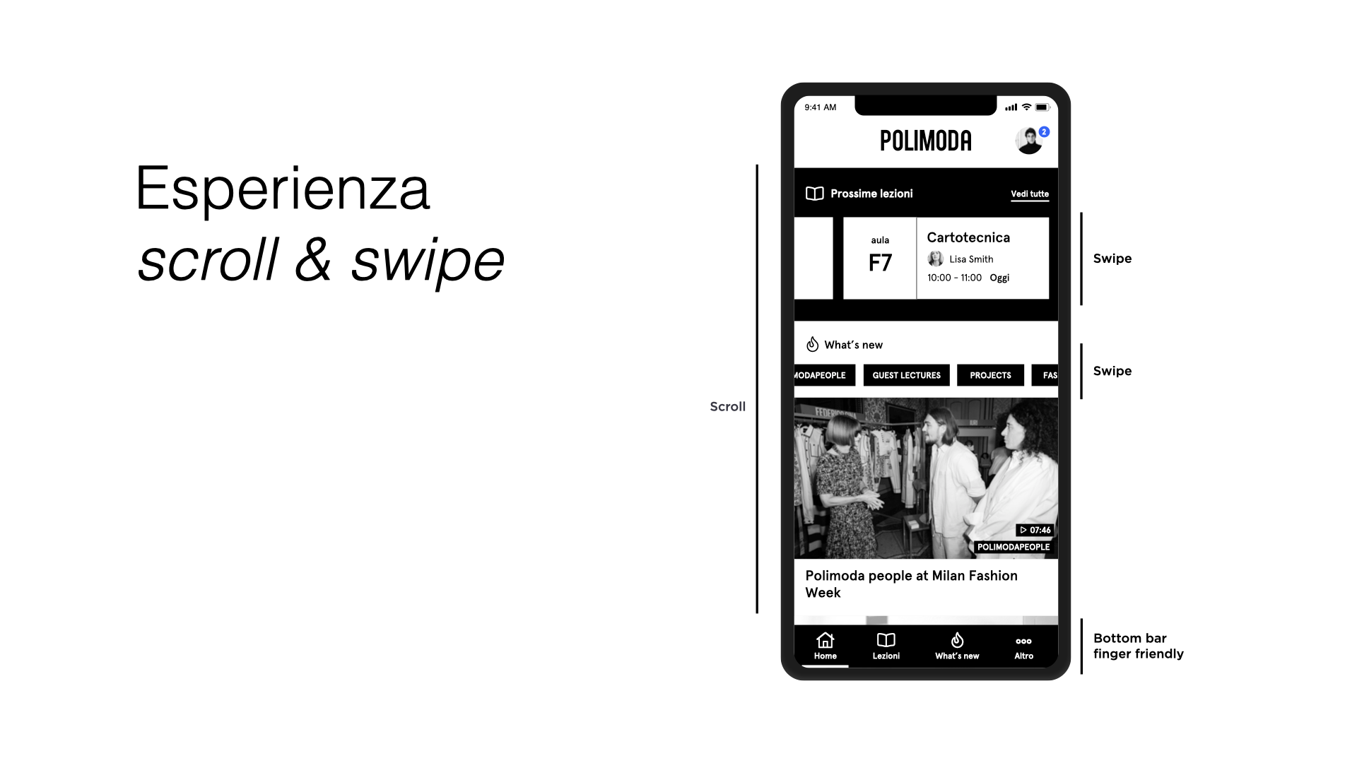
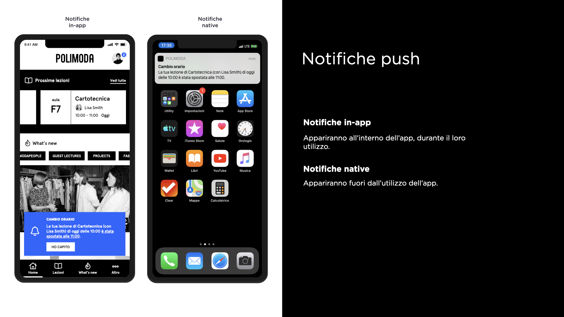
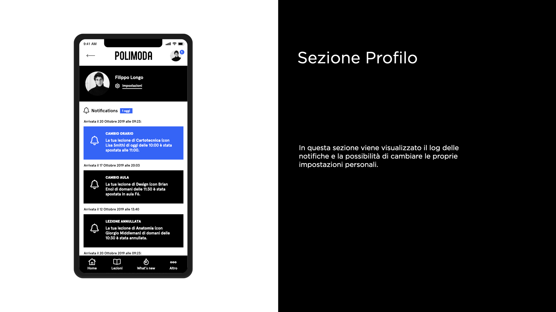
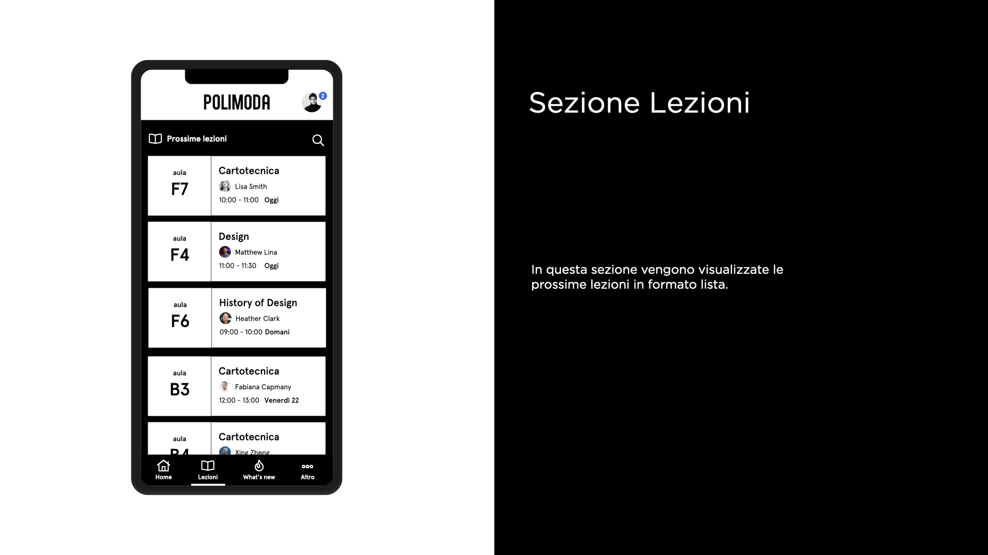
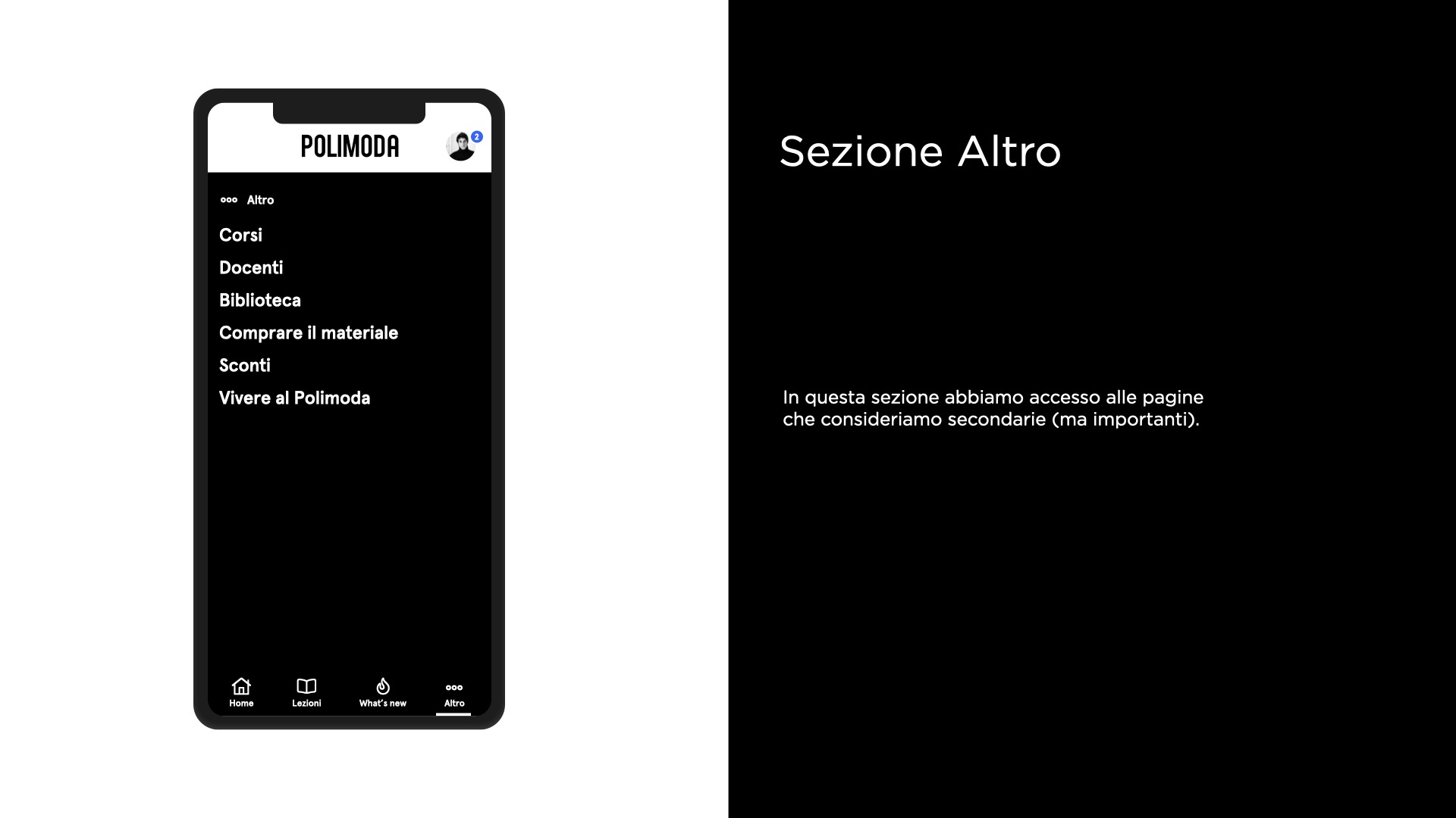
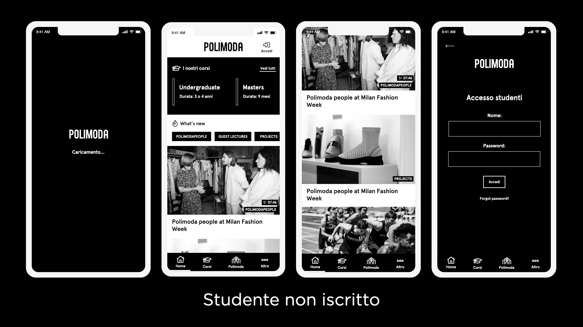
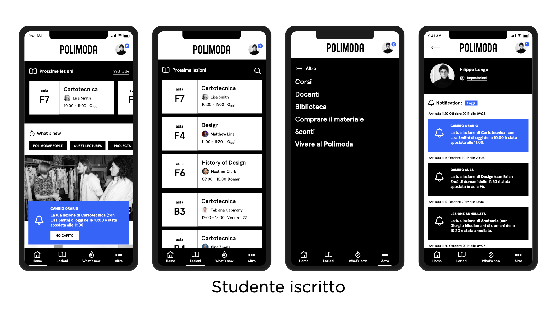
With the gathered materials and approval from Polimoda's decision-makers, I designed the first version of wireframes based on our personas and OKR/KPIs:
The wireframe proposals went through multiple iterations, leading to a final version that satisfied everyone. Cantiere Creative's visual design department then took the lead for the aesthetic aspects of the project while I monitored UX decisions during both design and development phases.
Once the app was live, we created a website that mirrored the app's design and functionality for desktop users, as the app's layout and features translated well across various environments.
contact
Let's Work Together!
info@amirati.it
+39 3932696291
works
Other Projects
Redesigning the Uffizi Museum's Online Experience
As Head of UX, I provided wireframes, conducted user interviews, performed user tests, and facilitated design thinking workshops.
A User-Centered Dashboard for DatoCMS (and a website)
I worked on redesigning the user dashboard, analyzing personas and competitors, as well as refreshing the front website to create a more outcome-focused communication strategy.
This is How I Designed a Real Estate Software with a Performance-Driven Method
As Head of UX, I led a comprehensive analysis, redefined the platform's performance, and designed features to improve the overall user experience, changing and enhancing the real estate agents workflow.
