- Workshops
- Interviews
- Wireframes
- UI Screens and more
This project was delivered by Cantiere Creativo.
As Head of UX, I led a comprehensive analysis, redefined the platform's performance, and designed features to improve the overall user experience, changing and enhancing the real estate agents workflow.
Introduction
Italiana Immobiliare is the largest real estate franchising network in Florence and its surrounding areas, boasting 25 branches and a staff of over 200 people. When they approached us, their existing management software was slow, error-prone, and frustrating to use, making it difficult and sometimes impossible for agents to work effectively.
Analysis and Research
We began an extensive analysis with Cantiere Creativo's development team. During this phase, we:
- Conducted live interviews with dozens of agents
- Created a survey based on interview responses and distributed it to the entire staff
- Held numerous workshops focused on performance goals for the new management software
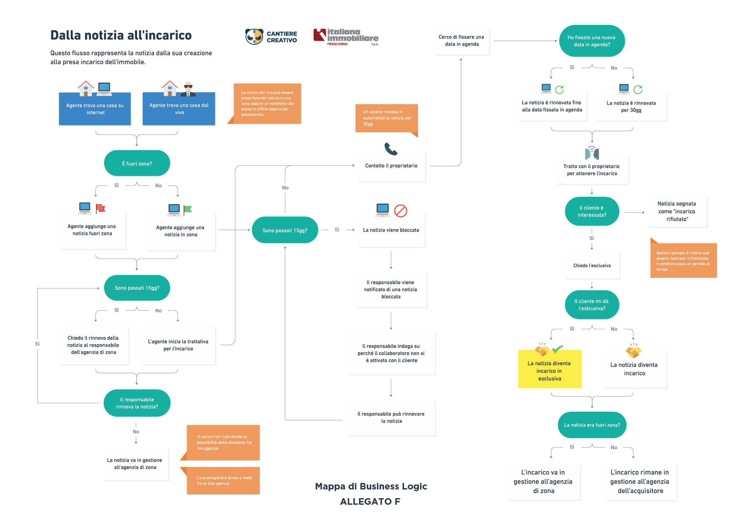
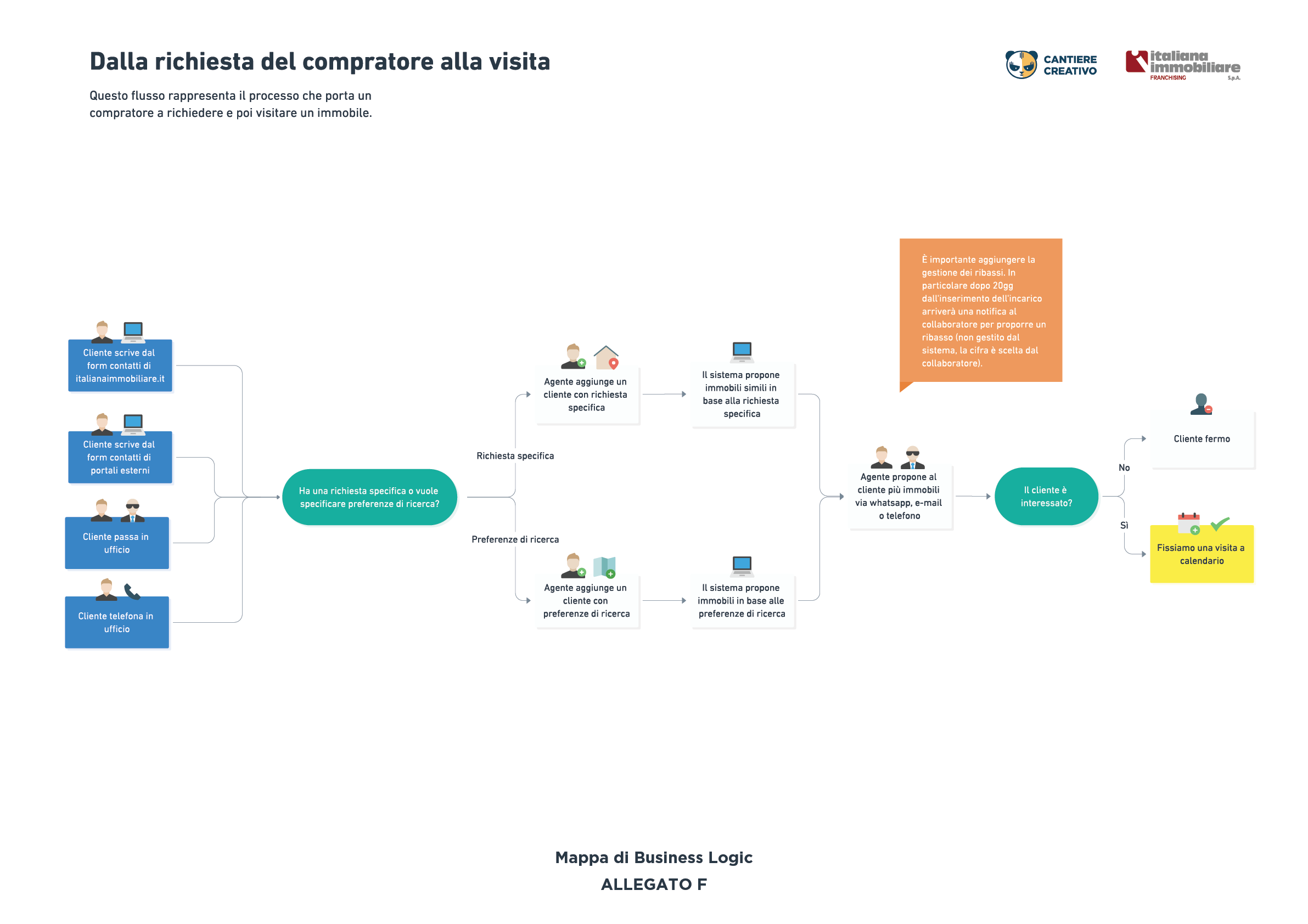
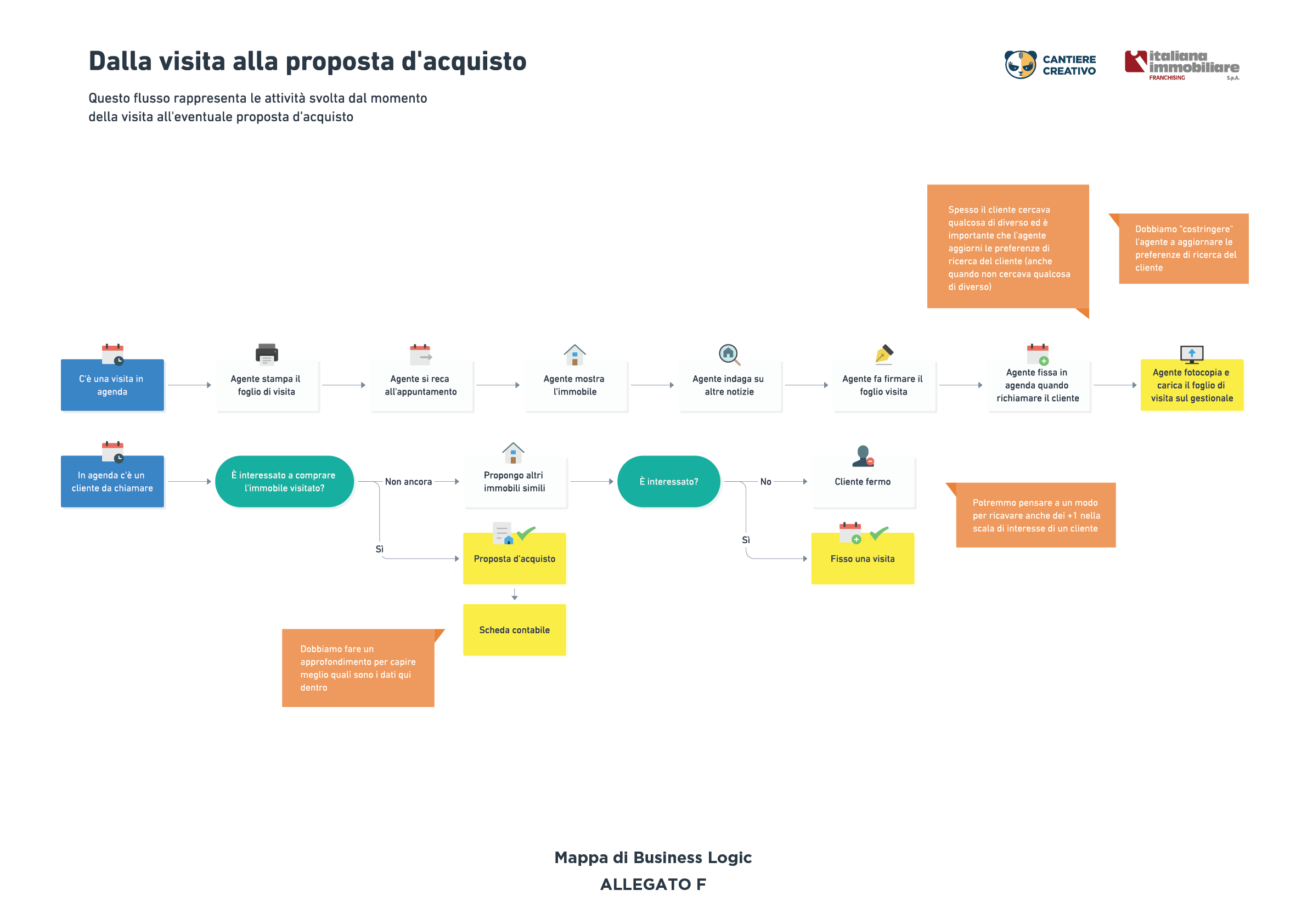
- Mapped their entire business logic
Our live interviews were conducted in pairs, with one person asking questions and the other taking notes, along with a recording device for backup. The interviewee would sign a release form stating that the voice recording was for internal product design purposes only. Over the years, we have refined our live interview process.
Here is the business logic map:
Performance-Based Design
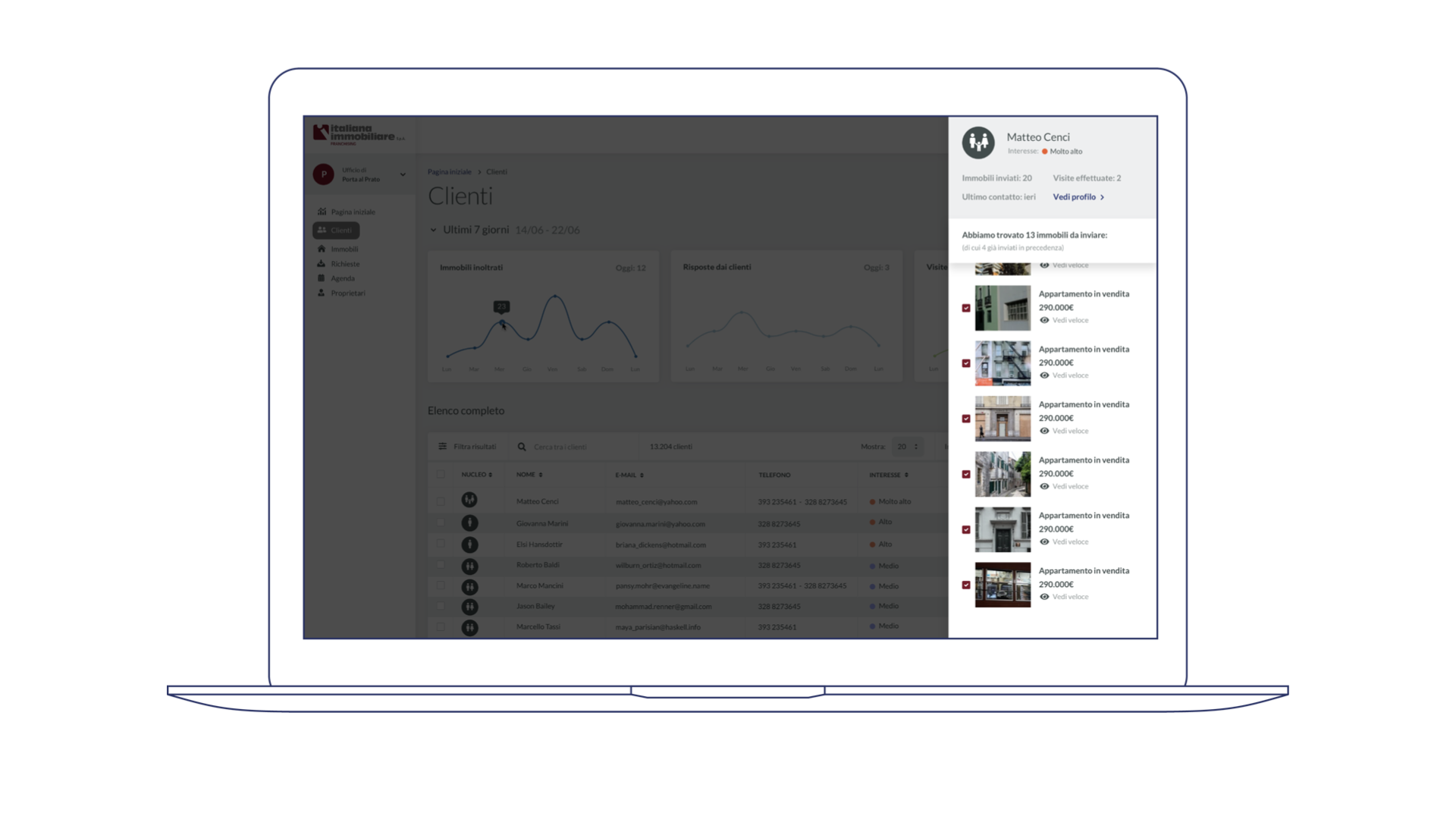
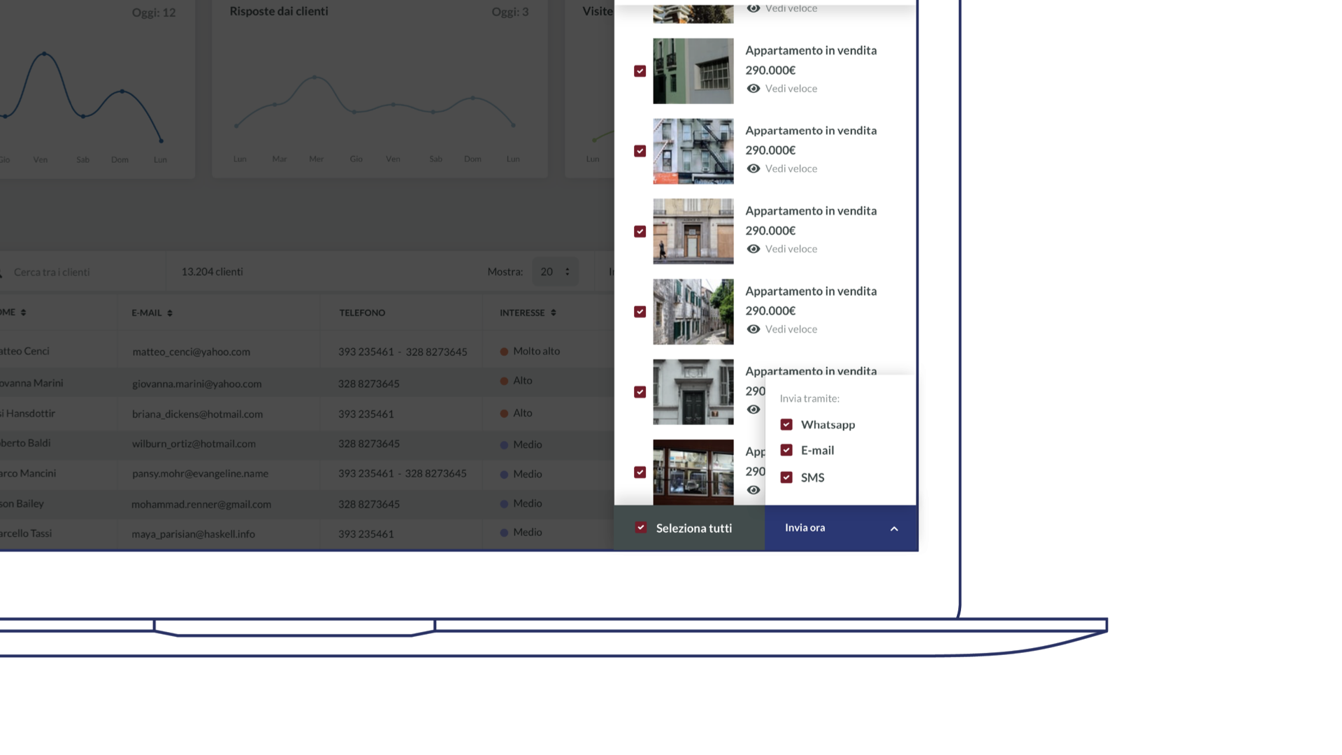
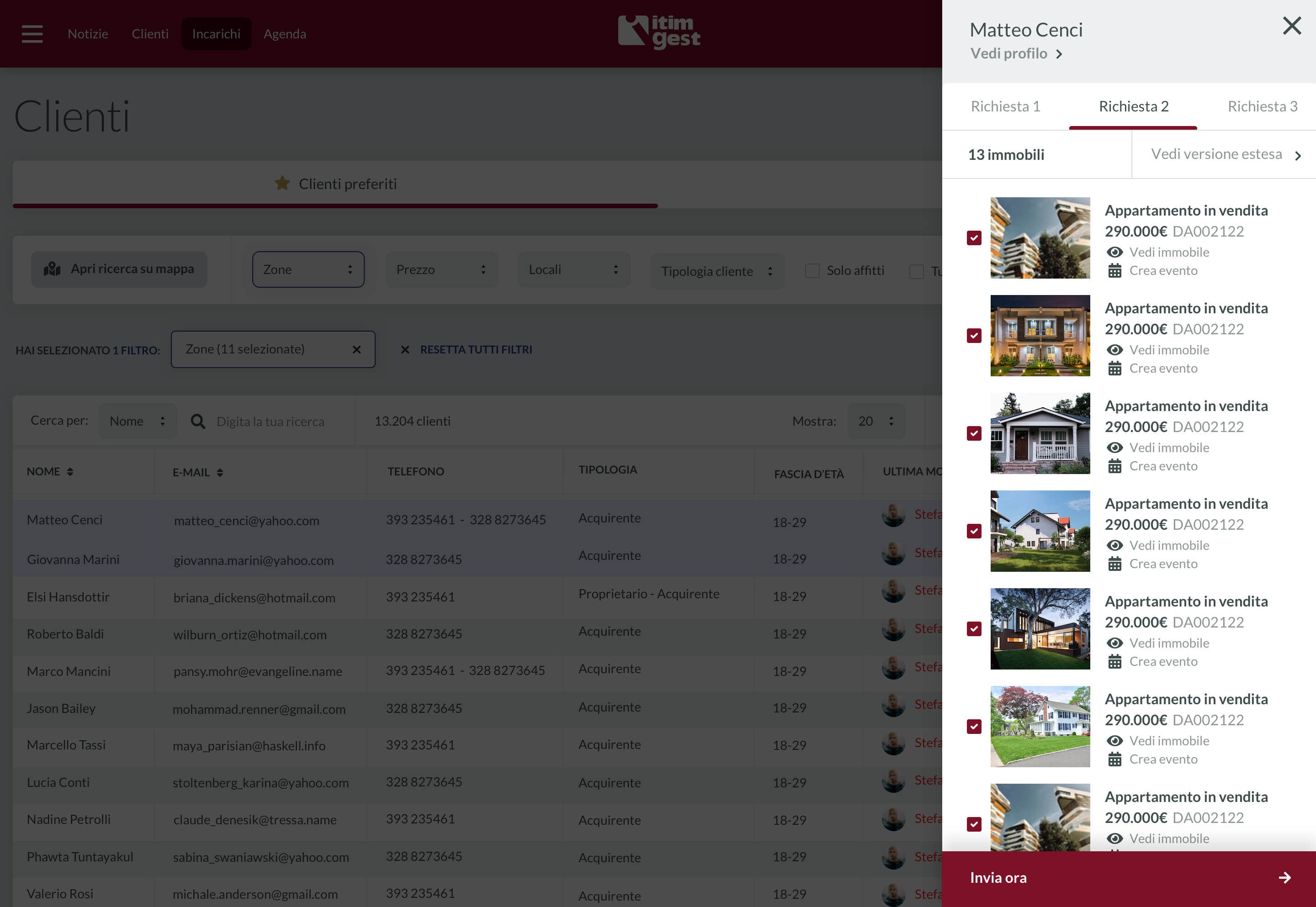
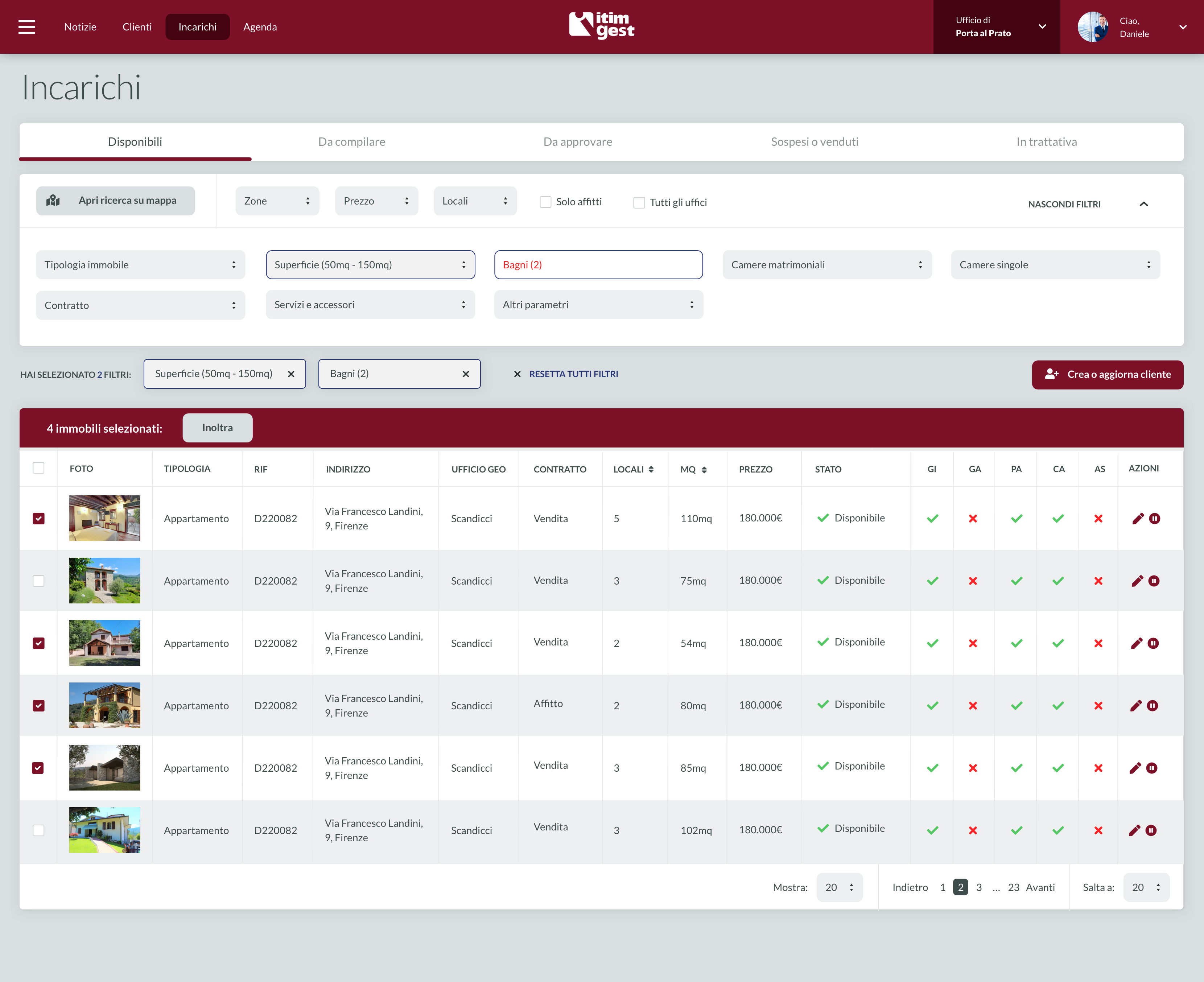
Once the UX groundwork was laid (and the development team had analyzed the existing code, documented the entire data model, and identified any gaps), I designed sections of the software based on performance objectives. The first objective was to increase the speed at which agents forward properties to clients. We were able to reduce the time from 2 minutes to 20 seconds (assuming the forwarding of 5 properties):
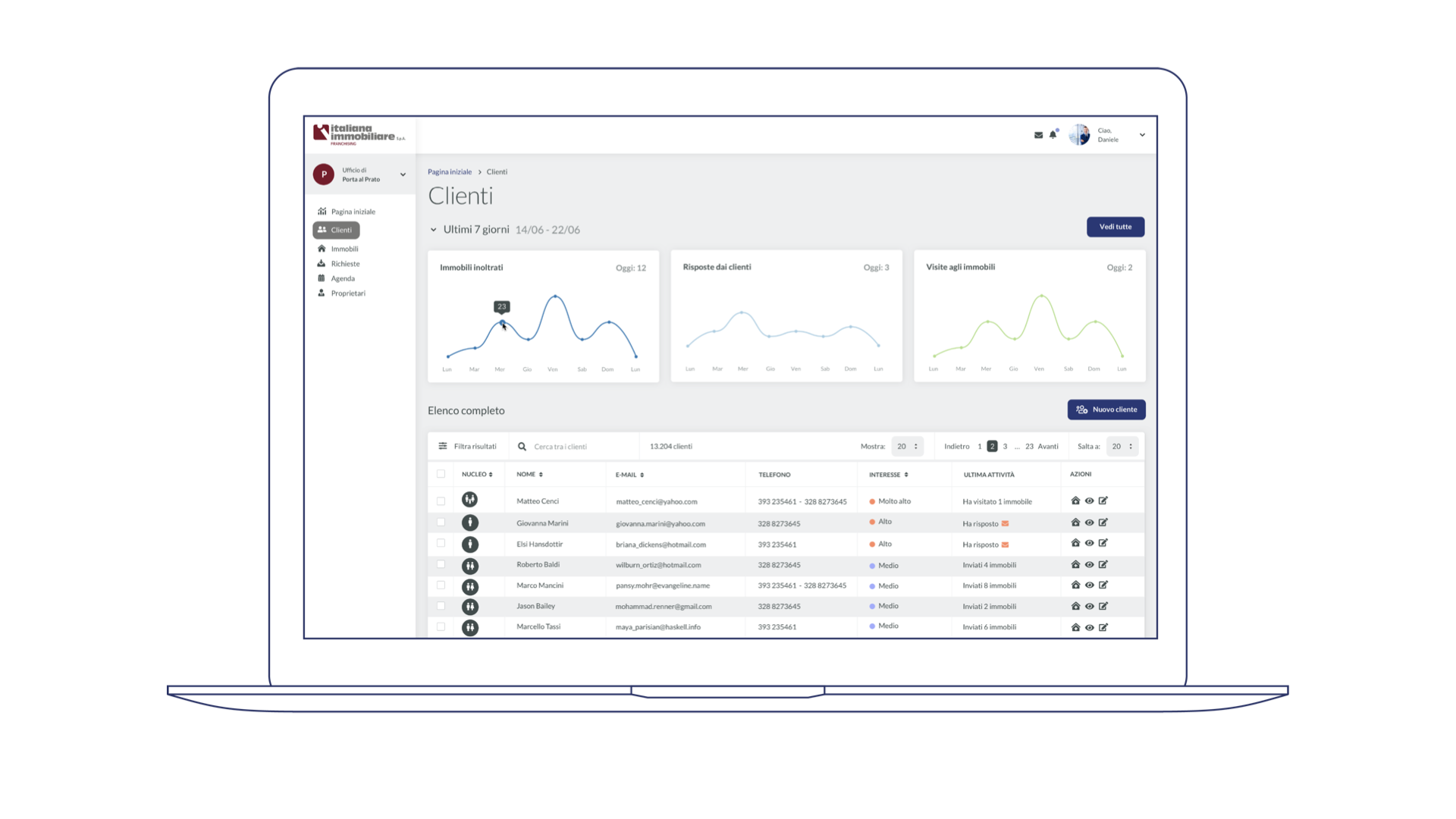
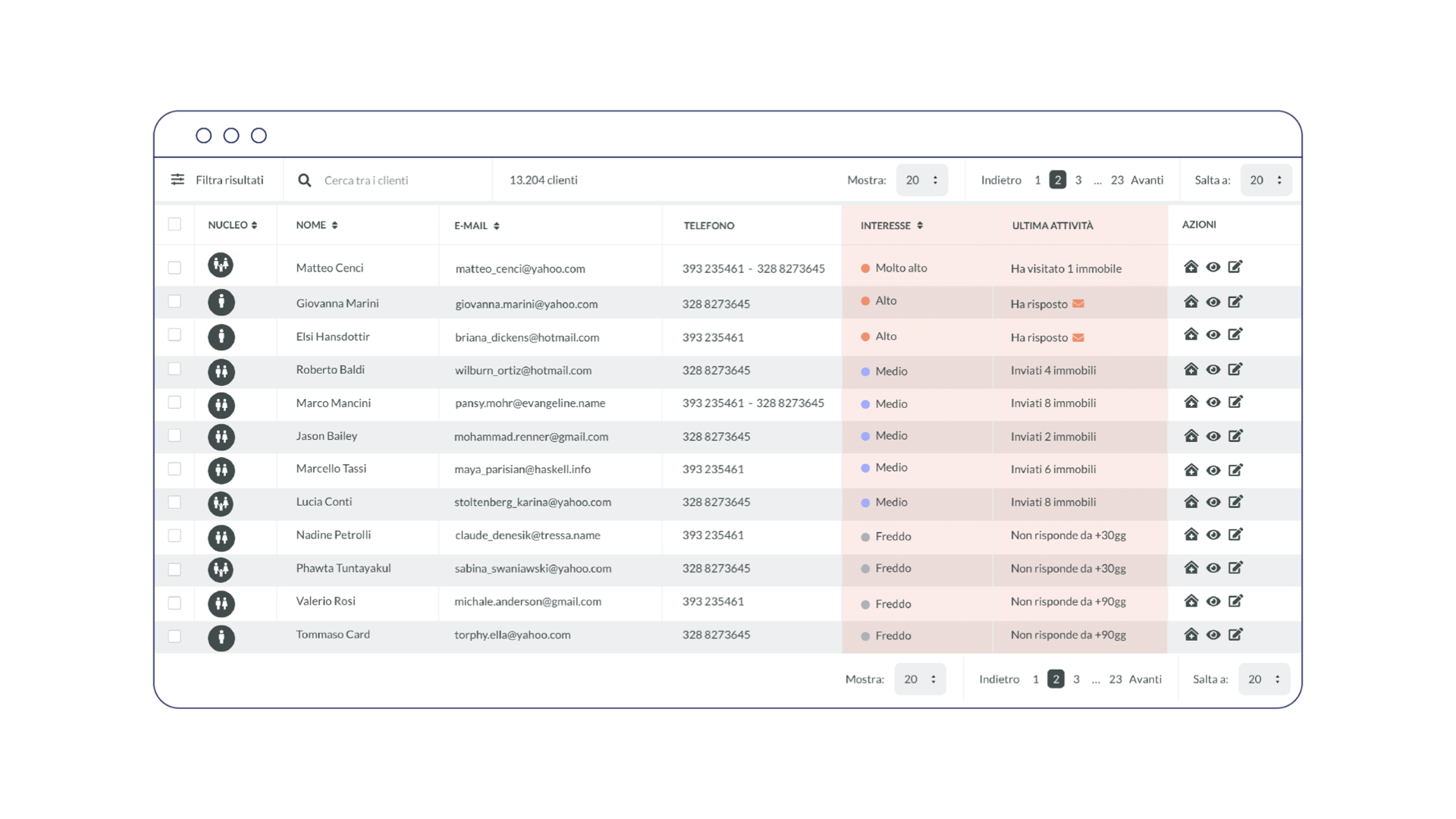
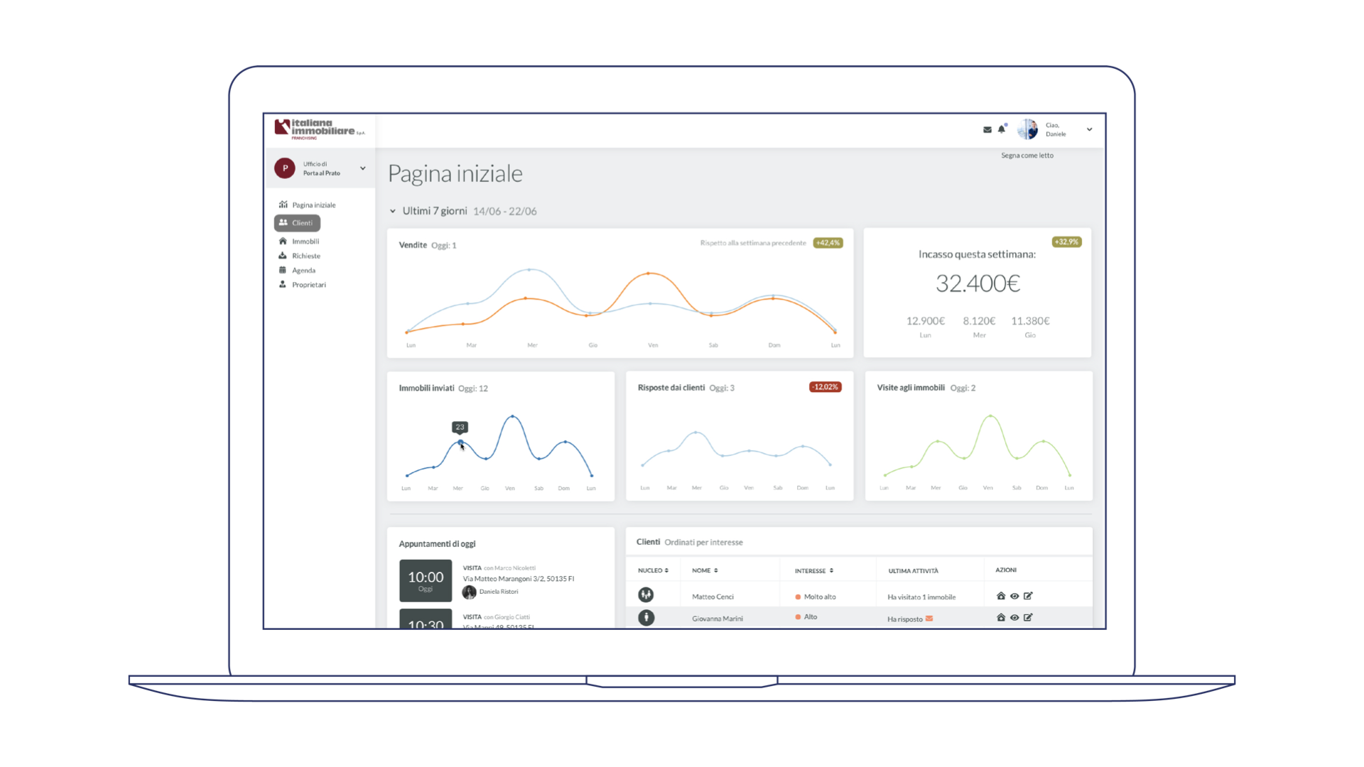
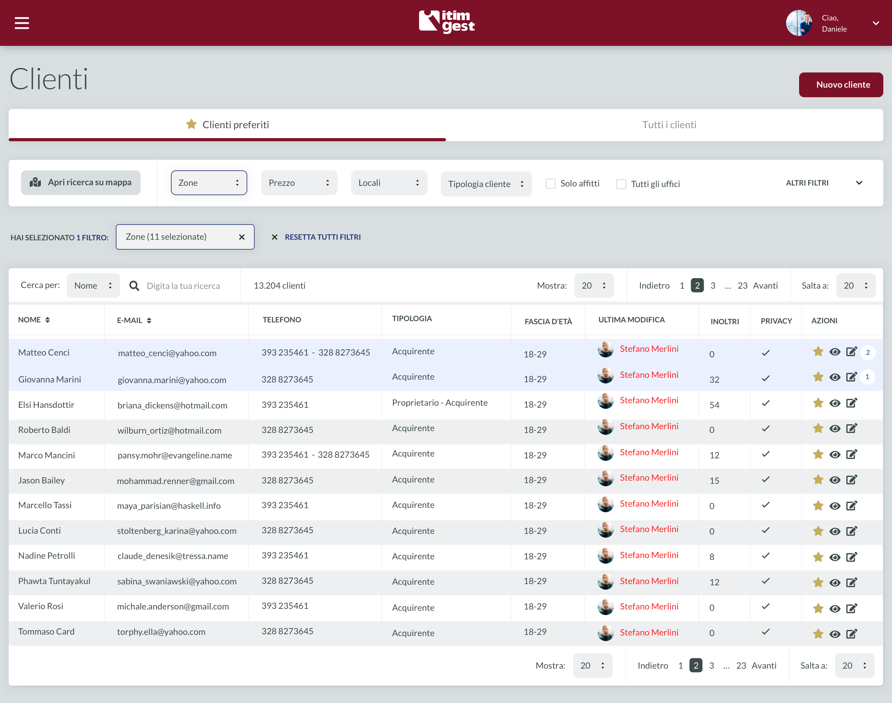
Another goal was to increase customer conversion rates. To achieve this, I designed parameters that measure a client's level of interest and engagement with agent emails and messages:
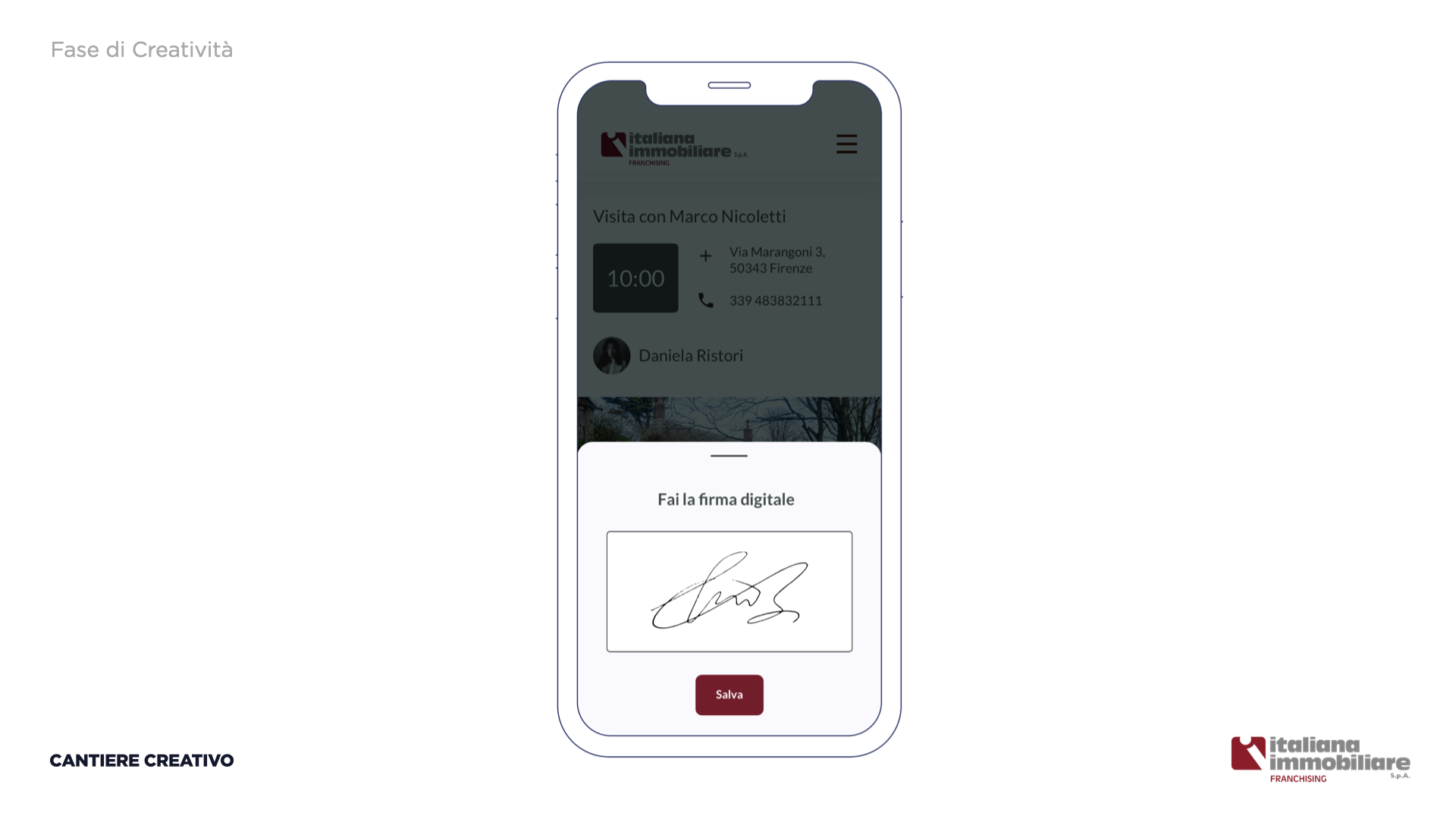
Furthermore, we aimed to reduce paper usage and improve office efficiency with digital signatures. This change cut the time to print and sign documents from 4 minutes 30 seconds to 15 seconds, resulting in 3,250 saved printed papers per month and 625 hours a month saved for all the agents involved in the print and sign process. This significantly sped up the administrative flow by 8 times (these numbers were proved and tested with a selected agency):
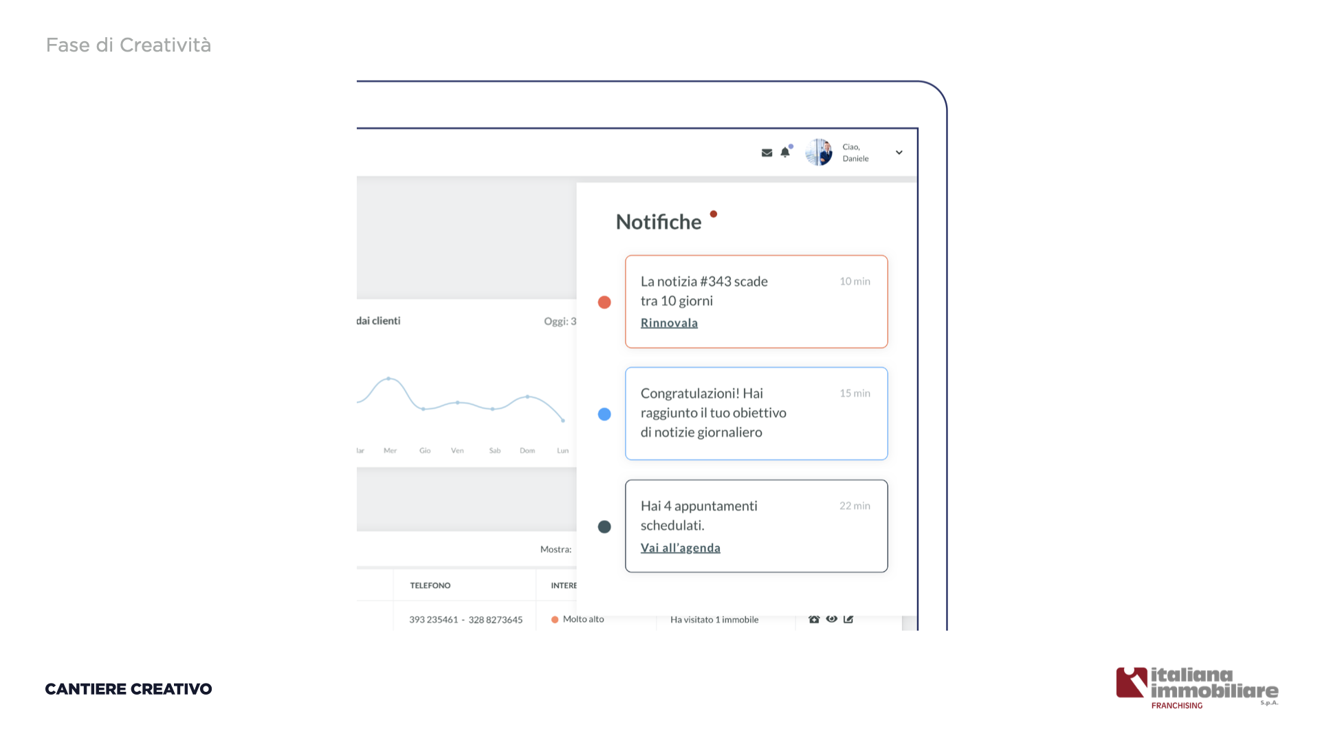
Lastly, we sought to enhance agent performance through system notifications that send reminders about deadlines and congratulate agents on surpassing their goals:
Platform Launch & Current Version
Before launching the platform, we conducted a small-scale test with a "beta group" agency, using a month of usage to test onboarding and optimize errors. The platform was officially launched in November 2021, and although it initially struggled to operate correctly due to the various user types and permissions involved, it reached an excellent performance level within a few months.
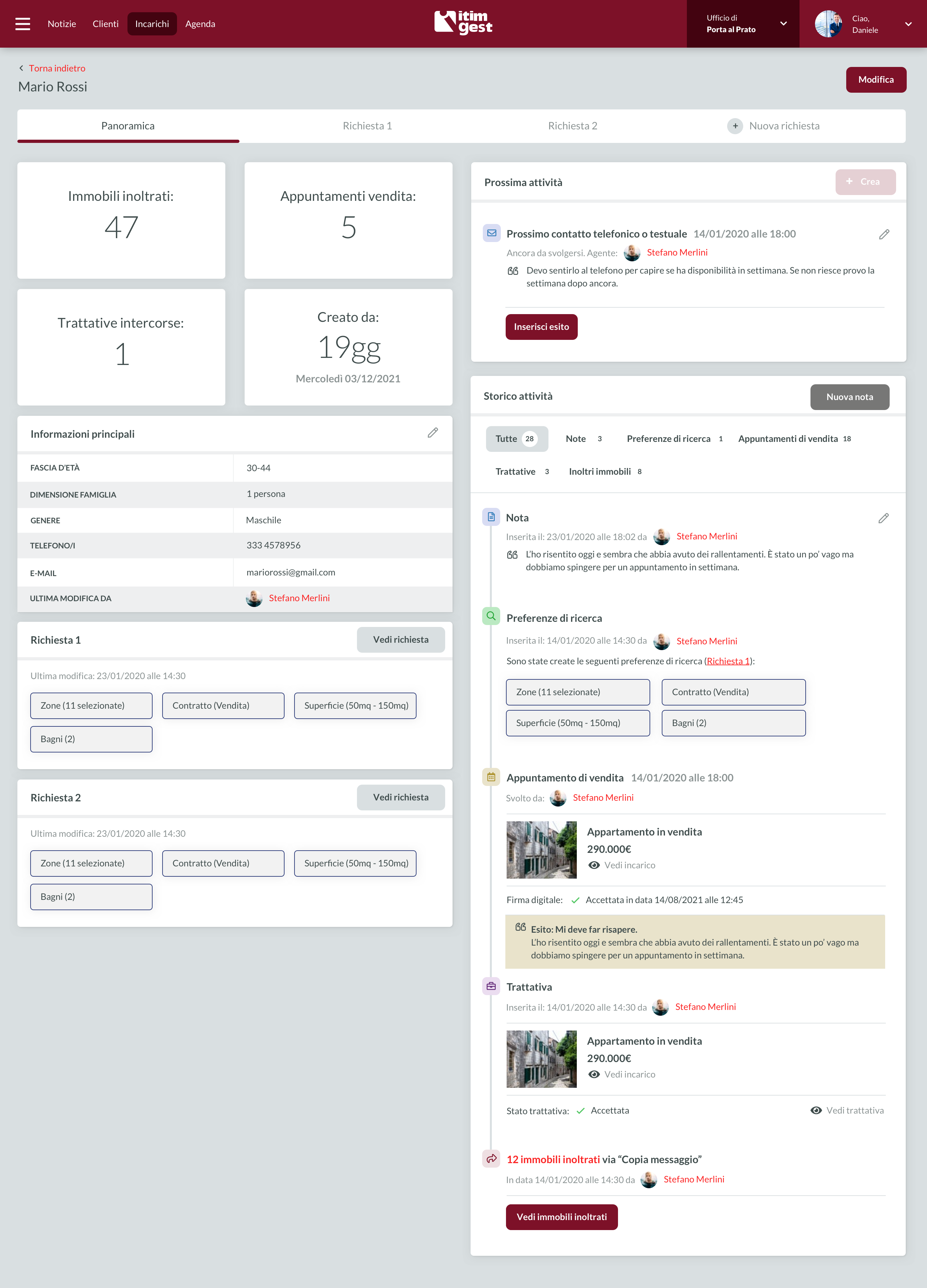
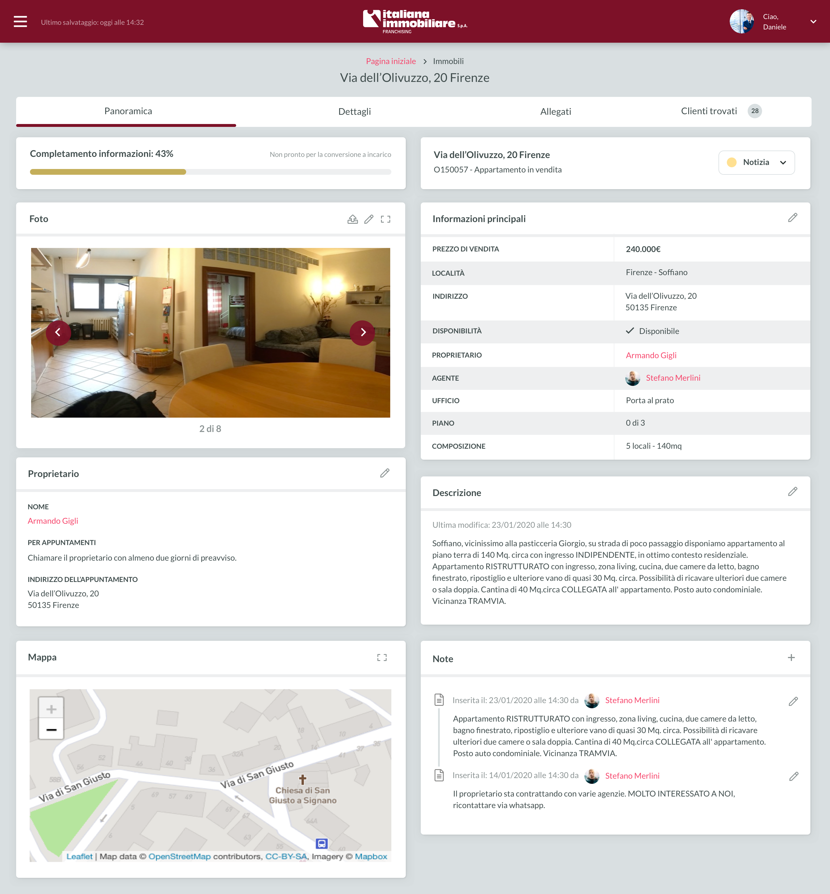
Here are some screens of the current version:
Evolution
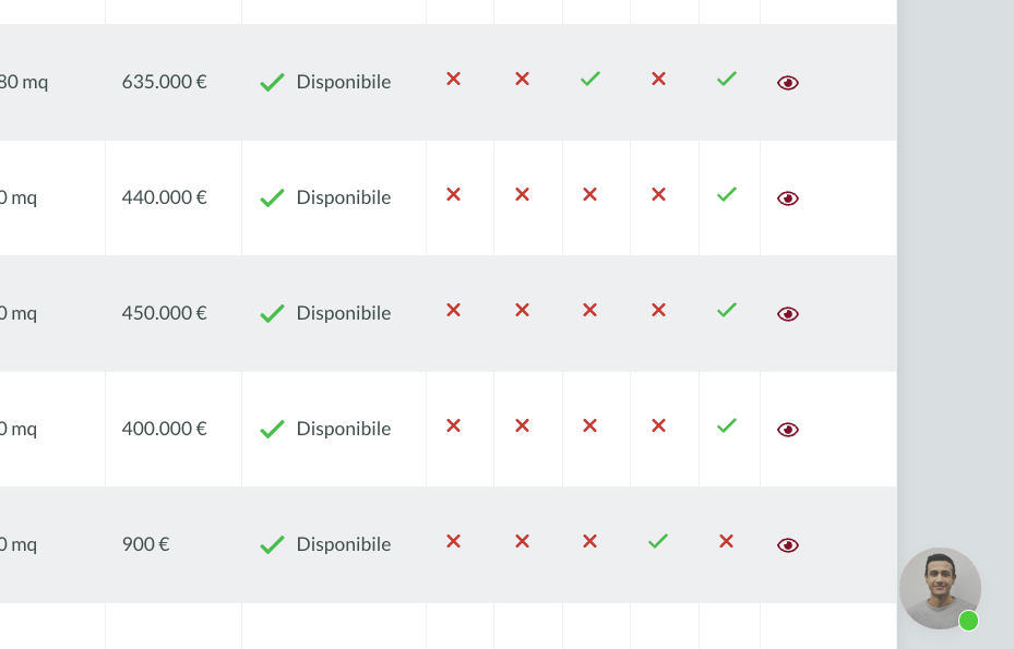
From day one, we implemented Crisp to manage all agents via chat, and I am currently responsible for this aspect. This enables me to have a two-way conversation system with agents, learn their shared desires, and receive immediate feedback on any issues:
Conclusion
This ongoing project has been in progress for four years, and during this time, I have designed numerous additional sections and am currently responsible for the platform's evolutionary progress. I have also designed the new public website, which is under development and will soon replace the existing site.
contact
Let's Work Together!
info@amirati.it
+39 3932696291
works
Other Projects
Redesigning the Uffizi Museum's Online Experience
As Head of UX, I provided wireframes, conducted user interviews, performed user tests, and facilitated design thinking workshops.
A User-Centered Dashboard for DatoCMS (and a website)
I worked on redesigning the user dashboard, analyzing personas and competitors, as well as refreshing the front website to create a more outcome-focused communication strategy.
A UX Fashion Success Story for the Polimoda App
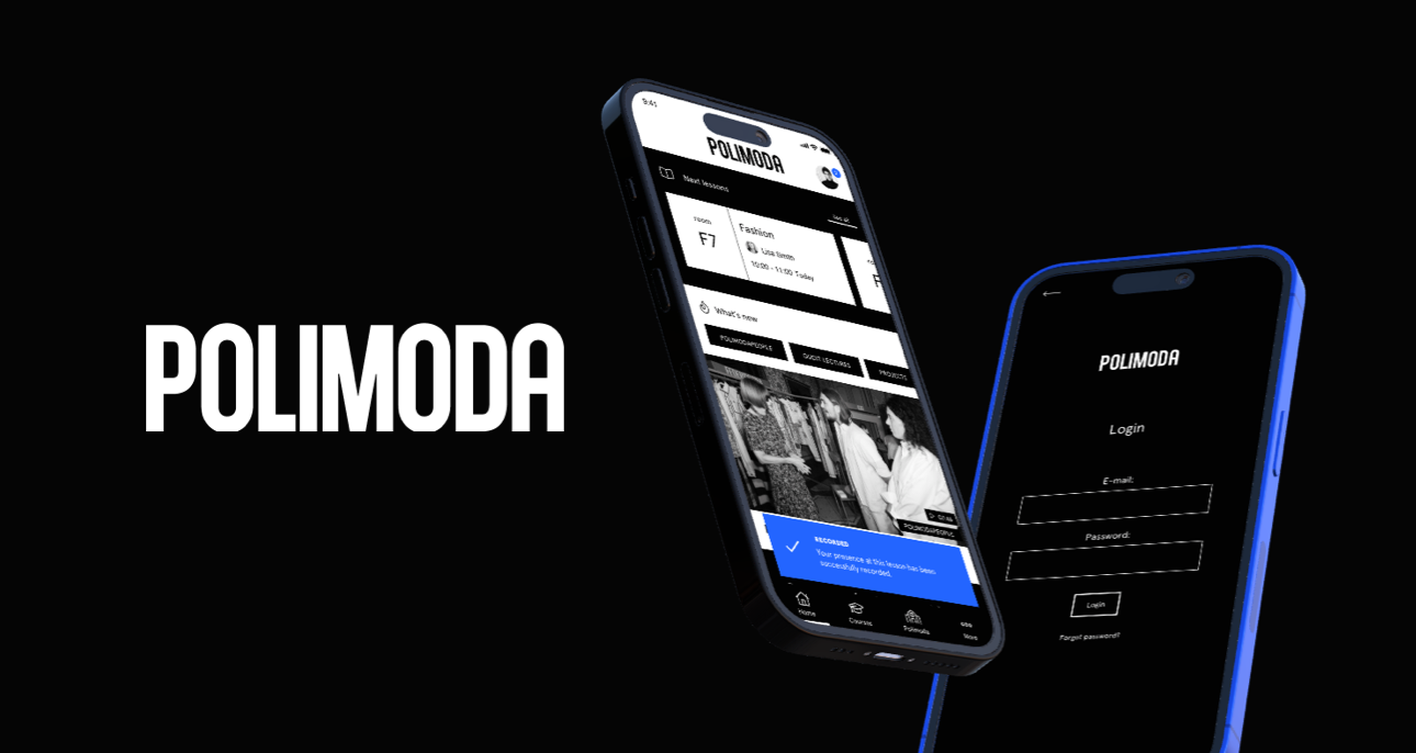
I focused on conducting extensive analysis, strategic workshops, and designing wireframes to create an app that catered to Polimoda's students and visitors while maintaining high aesthetic standards.


